When Treatment Timing Is Messy: Event-Study Design for Staggered Rollouts
You designed an experiment. Leadership signed off. The rollout took on a life of its own. Now what?
Introduction
All data in this post is simulated for demonstrative purposes. No real or proprietary data was used.
You work at a company with hundreds of independently operating locations. The data science team designs an experiment: roll out new software to a subset of locations, keep the rest as a control group, and measure the impact on some efficiency metric. Everything is ready to go and the experiment looks sound.
In practice though, large-scale rollouts almost always end up staggered. The rollout was supposed to start in March across all treatment locations simultaneously. Instead, some locations start in March, some in June, and a few don’t start until September. By the end of the year, every treatment location adopted on its own timeline, and there’s no single “before” and “after” to compare.
This is the staggered adoption problem, one of the most common compliance challenges in field experiments. The good news: there’s a well-established framework for handling it.
This post walks through how standard Difference-in-Differences works, where the assumptions break under staggered adoption, and how an approach called “event-study design” fixes it. We’ll cover two scenarios: one where you have a clean holdout control group, and one where every location eventually gets treated. Full code is in the Appendix if you want to skip the wall of text.
What Is Difference-in-Differences?
Difference-in-Differences (DiD) compares the change in outcomes for a treatment group to the change for a control group. By subtracting the control group’s trend, you strip out background noise (seasonality, company-wide shifts) and isolate what’s attributable to the intervention. There are a number of great articles that cover the fundamentals well (this one from Bukalapak is a solid starting point). The core logic boils down to this:
| Pre-Period | Post-Period | Change | |
|---|---|---|---|
| Treatment | $Y_{T,pre}$ | $Y_{T,post}$ | $\Delta_T$ |
| Control | $Y_{C,pre}$ | $Y_{C,post}$ | $\Delta_C$ |
| DiD Estimate | $\Delta_T - \Delta_C$ |
The key assumption: both groups need to have been trending in the same direction before treatment, the parallel trends assumption. If they weren’t, the whole framework falls apart.
DiD works cleanly when the rollout happens all at once. Everyone gets treated on the same day, there’s a clear “before” and “after,” and you can draw a single line between the two periods. In practice, that almost never happens, and that’s where this post picks up.
What Does Staggered Adoption Actually Look Like?
Let’s look at a case study with single-location examples. For each location, let’s say we have 3 trainees who each need 6 months of training on the new software. Each orange arrow below is one person’s training timeline (for this example, let’s assume in the data they either start/end on the first/last day of the month). There is no single month where treatment switches on. Every location defines its own adoption timeline.
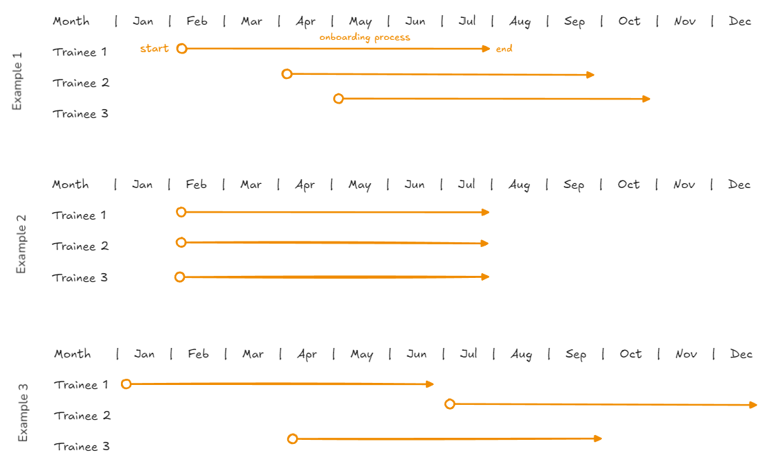 Each trainee is on a different timeline. Some managers start everyone together, others spread it out.
What about using heuristics?
The natural first instinct is to pick a single cutoff date. Maybe you use the median adoption month, or the month when “most” locations were done. Then you compare everything before that date to everything after.
The problem is: at any given calendar month, your treatment group becomes a mix of locations at completely different stages. Some have been fully operational on the new software for months. Some just finished training. Some haven’t started. When you average across all of them, you’re averaging together strong effects, weak effects, and zero effects. The result is a diluted number that underestimates the real impact.
This is composition bias. The mix of locations changes at every time point. At Month 8, your average might include some fully-adopted locations, some mid-training, and some that haven’t started. At Month 14, it’s a completely different mix. You’re not comparing the same metric to itself across time. The composition of your treatment group is shifting underneath you, and that shifting can even flip the directionality of your estimate.
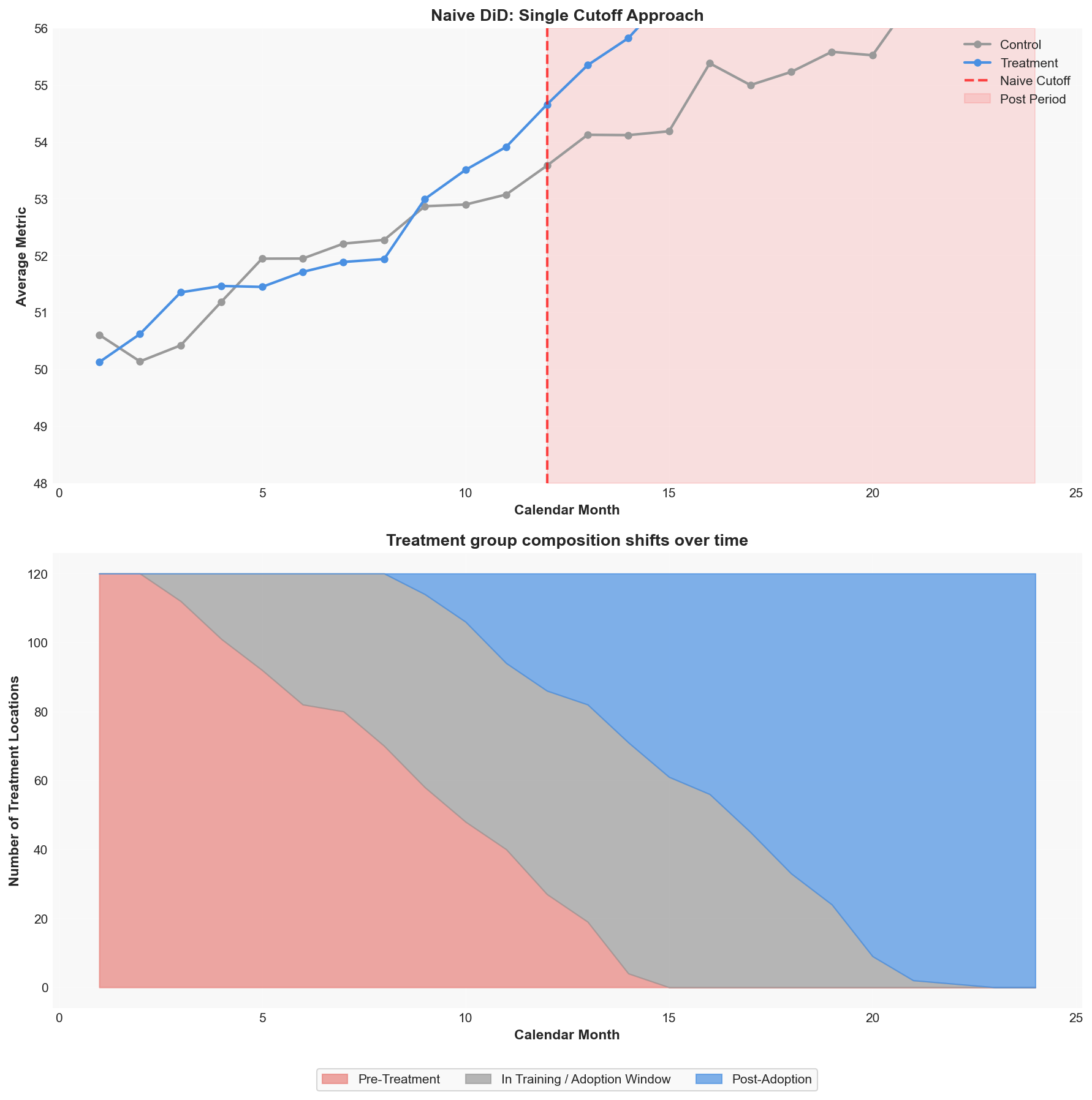 Top: A naive single-cutoff DiD looks clean but averages across locations at different adoption stages. Bottom: The actual composition of your treatment group shifts over time. A single cutoff blurs all of this together.
The Fix: Normalize to Event Time
Instead of forcing a single cutoff, we let each location define its own timeline.
Defining the Adoption Window
For each treatment location, we identify the adoption window: the period from when the first trainee completes training to when the last trainee completes training.
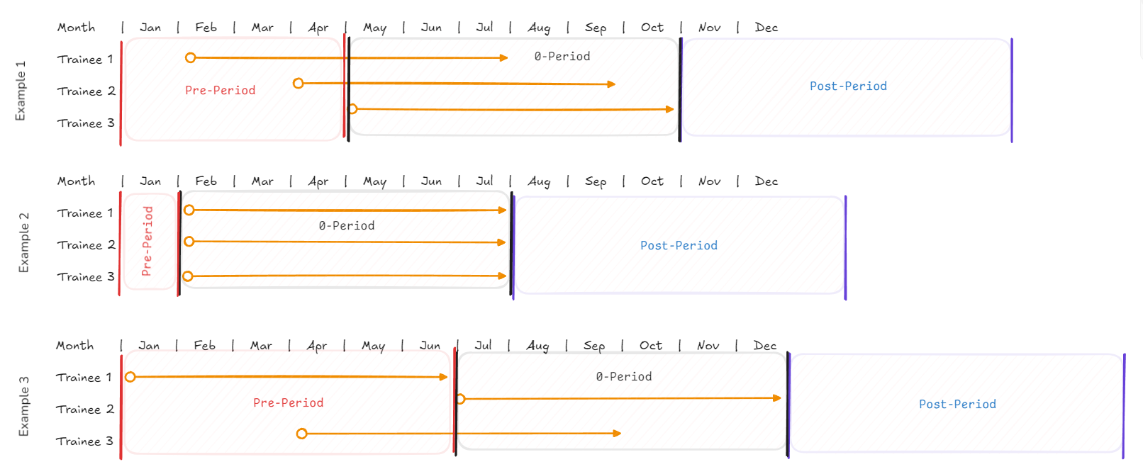 The same locations from above, now with the framework overlaid. Red = Pre-Period (baseline), gray = Period 0 (adoption window, blacked out), blue = Post-Period (where we measure the effect).
We assume that trends within this ‘period-0’ window are noisy. Some trainees have the new skills, others don’t. The location is in flux. My local Planet Fitness spent weeks renovating to install new machines, with much of the gym closed off. You wouldn’t survey visitors about the new equipment while half the floor is still behind caution tape.
The Three Zones
We split each location’s timeline into three zones:
Pre-Period (before the window): The location before any trainee completed training. This is the baseline. We measure metrics here and call these periods -1, -2, -3, and so on, counting backwards from the adoption window.
Period 0 (the adoption window itself): We black this out. Don’t measure it or interpret it. Metrics here are a blend of old and new with no clean read.
Post-Period (after the window): The location after all trainees finished training. This is where we look for the treatment effect. We call these periods +1, +2, +3, counting forward.
The Shift
Every treatment location, regardless of when it actually ramped up, is now on the same relative timeline. Period -3 means “three months before the adoption window started” for every location. Period +2 means “two months after the last trainee finished” for every location.
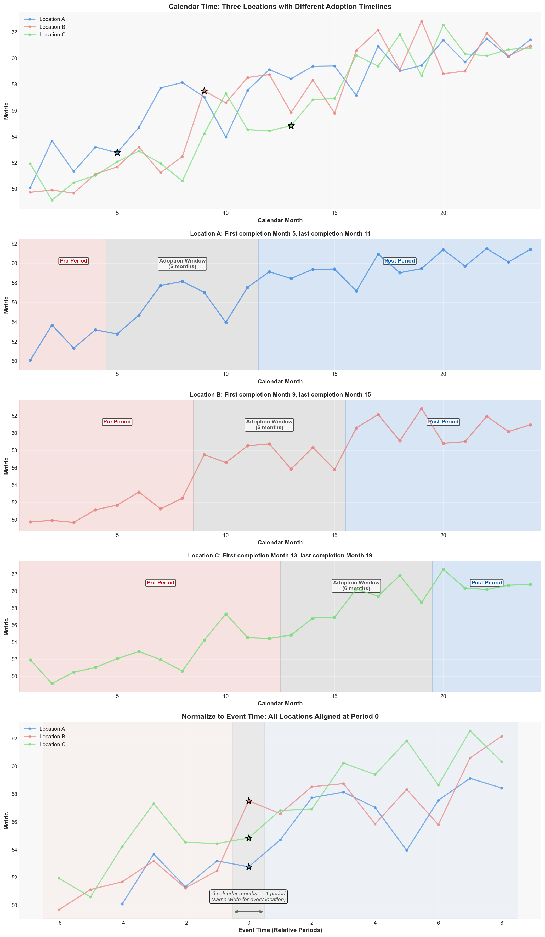 Top: three locations in calendar time with scattered adoption points. Middle rows: each location shown individually with its pre-period (red), adoption window (gray), and post-period (blue) zones highlighted. Each adoption window spans 6 calendar months. Bottom: after normalizing to event time, all three align at Period 0. Those 6 calendar months collapse to a single period, the same width for every location.
The star markers indicate when each location’s first trainee completed training. The middle rows make it clear that each location’s adoption window spans multiple calendar months, and that these windows land at different points in time. The bottom panel shows why this matters: after normalization, every location’s adoption window becomes one standardized period, making the comparison apples to apples.
Defining the Window: Why "Last Completion"?
There are a few ways you could define the adoption window. It’s worth being explicit about the choice and why it matters.
Option A: First start to last start. The window covers when trainees begin training. This makes sense if you’re studying how training disruptions affect operations (trainees pulled from their regular duties, workload shifting to others).
Option B: First completion to last completion. This is what we use (with a slight heuristic). The window covers when trainees finish training and can actually contribute using the new software (trainee efficiency after ramp up, is the new software actually helping?). The post-period starts when everyone is fully trained.
Option C: First start to last completion. The widest possible window, covering the entire training lifecycle. Useful if you want maximum separation between “definitely no treatment” and “definitely full treatment,” but it has the potential to black out huge chunks of data, and you’ll have to consider normalizing for extended time periods vs. shorter ones.
In this case example we are going to walk through Option B because the question we’re answering is: does the new software improve the metric? A trainee mid-course isn’t using the software yet. They can’t contribute to the outcome we’re measuring. The post-period should start when everyone can contribute, not when the first person started learning.
There’s one more wrinkle. If we followed Option B exactly, every location would have a different length of Period 0 (based on how spread out their completions are). To keep things comparable, we set a limit: all completions must fall within a 6-month window from the last completion. This preserves sample size while keeping the period-0 boundary consistent across locations.
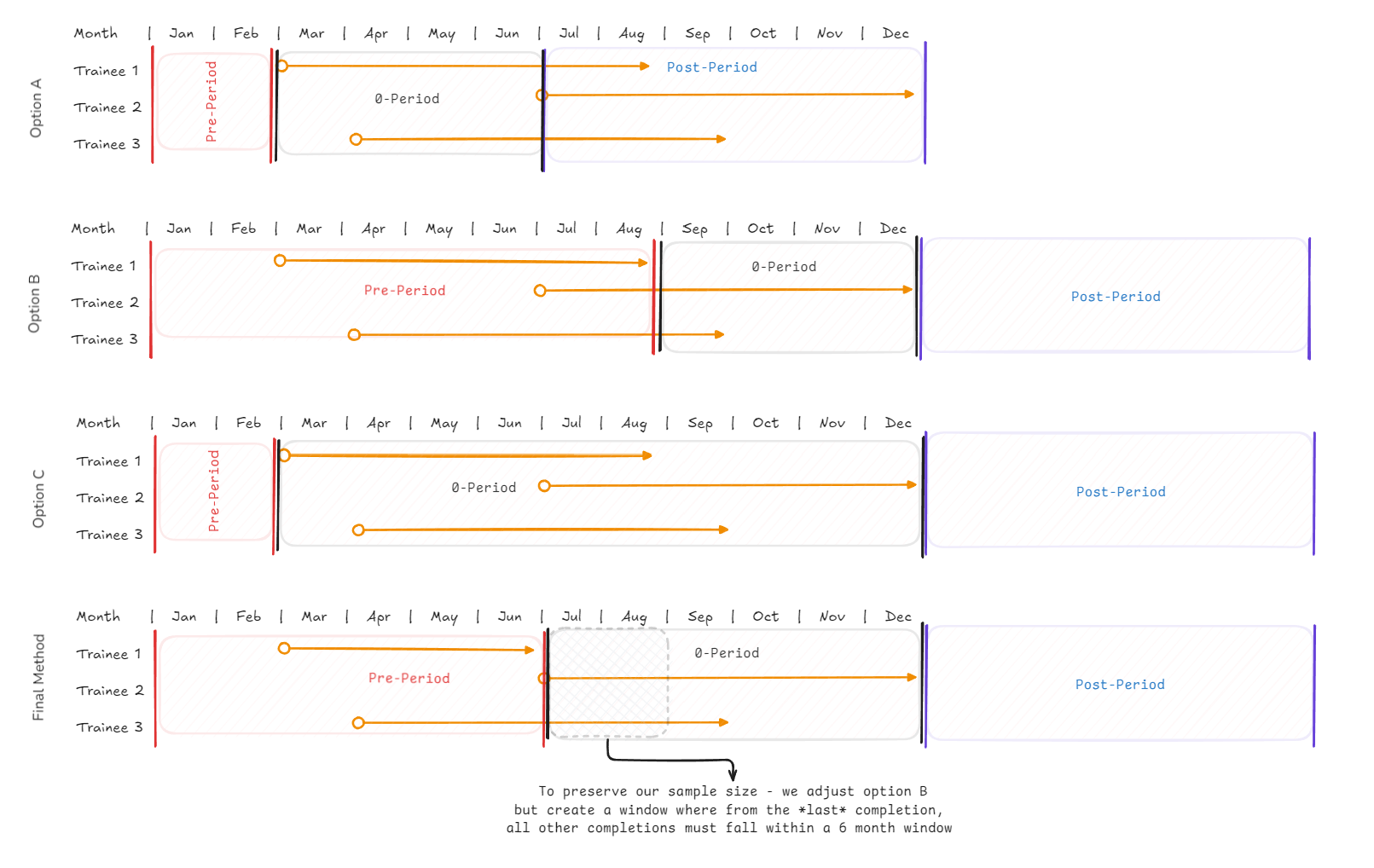 Options A through C define the adoption window differently. Our “Final Method” adjusts Option B: from the last completion, all other completions must fall within a 6-month window.
If we wanted to measure the impact of disruption on the ecosystem for example, Option A might be more appropriate. The right choice depends on what you’re measuring.
Getting a Clean Sample
Trimming the sample feels counterintuitive, but keeping every location regardless of data quality introduces more noise than it removes. We apply three filters, and each one has the same underlying logic: without it, the read is less trustworthy. In a real analysis, each filter should map to a clear business justification, not just a statistical one.
Filter 1: Bounded Adoption Window
If a location’s adoption window stretches beyond 6 months, we set it aside for this analysis. If it took 14 months from first completion to last, the blackout window would eat almost the entire timeline. There wouldn’t be enough clean pre or post data left to measure anything meaningful. Conversely, some windows might be very short (say, all completions within 1 month). We still pad Period 0 to a minimum length so the blackout captures any immediate transition noise rather than letting it leak into the post-period.
For our simulation, I purposely made the data fall within this window to make it easy. For this case, we assume training itself takes 6 months, and most managers either trained everyone together (adoption window = 0 months) or staggered within a few months. The locations with extremely long adoption windows were the exception.
This filter has a downside worth noting. By blacking out the entire adoption window, we lose information about what happens during the transition itself. If some trainees are already creating impact while others are still in training, that partial effect gets thrown away. In cases where the transition period IS the thing you want to study (for example, measuring how quickly a team ramps up), a different framework would be more appropriate.
There’s a potential upside too: novelty effects that inflate early results get absorbed by the blackout window and don’t contaminate the post-period read.
Filter 2: Minimum Pre-Period Data
In this example, we use at least 6 months of pre-period data for every location. We need to validate that treatment and control locations were trending similarly before adoption. If a location only has 2 months of pre-data, we can’t be certain whether its pre-trend was flat, rising, or falling. That makes the parallel trends test unreliable for that location.
There’s a more technical reason too. If some locations contribute data at Period -6 and others don’t, the set of locations in your average changes across time periods. That’s composition bias again, the same problem that broke the single-cutoff approach. By requiring every location to have data across the full analysis window, we keep the composition constant. Period -6 and Period +6 contain the exact same set of locations. The comparison then remains apples to apples.
Filter 3: Minimum Post-Period Data
Same logic in the other direction. We need enough post-adoption months to actually measure whether the treatment effect materializes, ramps up, or fades. If we only see one month of post-data, we can’t tell whether the lift is real or just noise from a good month.
The Tradeoff
Every filter costs sample size. We’re trading breadth for a cleaner read. The treatment effect we estimate applies to “locations that adopted within a reasonable timeframe and had enough data on both sides.” In DiD, reducing bias before looking at results is the whole point. We normalize as closely as we can before making any comparison.
Scenario A: Clean Holdout Control
The Setup
This is the simpler case. You designed the experiment with a proper holdout: 120 locations get the new software (still staggered), and 80 locations that never adopt during the observation period. Those 80 locations are the control group for the entire analysis.
| Group | Locations | Role |
|---|---|---|
| Treatment | 120 (staggered adoption) | Receive software on varying timelines |
| Control | 80 (never adopted) | Our counterfactual: what would have happened without the software? |
The control group captures background trends at every point in time. For each treatment location at, say, Period +2 (which might land in May for one location and August for another), we compare that metric to the control group’s data at the same calendar month.
Here’s how the concurrent comparison works in practice. The table below shows three treatment locations whose adoption windows close at different months (meaning all trainees finished by that month). At any given calendar month, each location is at a different point in its own event timeline. “Post +2” means that location is 2 months past the end of its adoption window. The key insight: we compare each location to the control group at the same calendar month, not the same event-time period.
| Calendar Month | Loc A (window closes M6) | Loc B (window closes M10) | Loc C (window closes M14) | Control Avg |
|---|---|---|---|---|
| M3 | Pre-period | Pre-period | Pre-period | ~51 |
| M8 | Post +2 (compare to control →) | Pre-period | Pre-period | ~53 |
| M12 | Post +6 | Post +2 (compare to control →) | Pre-period | ~54 |
| M16 | Post +10 | Post +6 | Post +2 (compare to control →) | ~55 |
Read each row as a snapshot of one calendar month. At M8, Location A is already 2 months past its adoption window (Post +2), while B and C haven’t even started. All three are compared to the same control average at M8. By M16, all three are in their post-period, but at different distances from adoption. The regression sorts this out: location fixed effects absorb baseline differences, time fixed effects absorb calendar-month trends, and the treatment × period interactions isolate the effect at each distance from adoption.
The parallel trends assumption is the foundation. Before any treatment happened, were treatment and control locations moving in the same direction at the same rate? If yes, we can attribute the post-adoption divergence to the treatment. If not, the results become harder to interpret.
Validating the Setup
Before looking at the results, we validate that the framework is working.
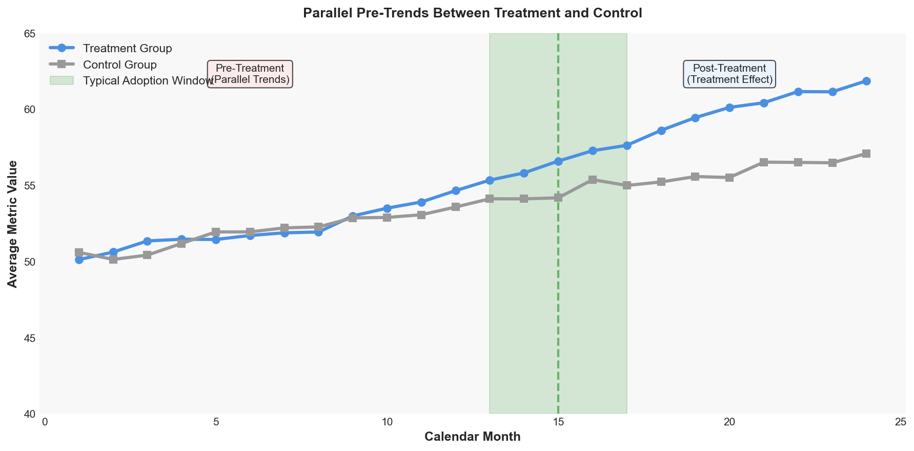 Average metric for treatment and control groups over calendar time. The two groups track closely in the pre-treatment period, then diverge after adoption begins.
The two groups moved together before treatment started. That’s not proof that the assumption holds in the post-period (it’s fundamentally untestable there), but it’s the best evidence we can get.
Raw Metric Lift
Before jumping to regression coefficients, it helps to see the actual metric values. This chart plots the average metric for treatment and control groups at each event-time period:
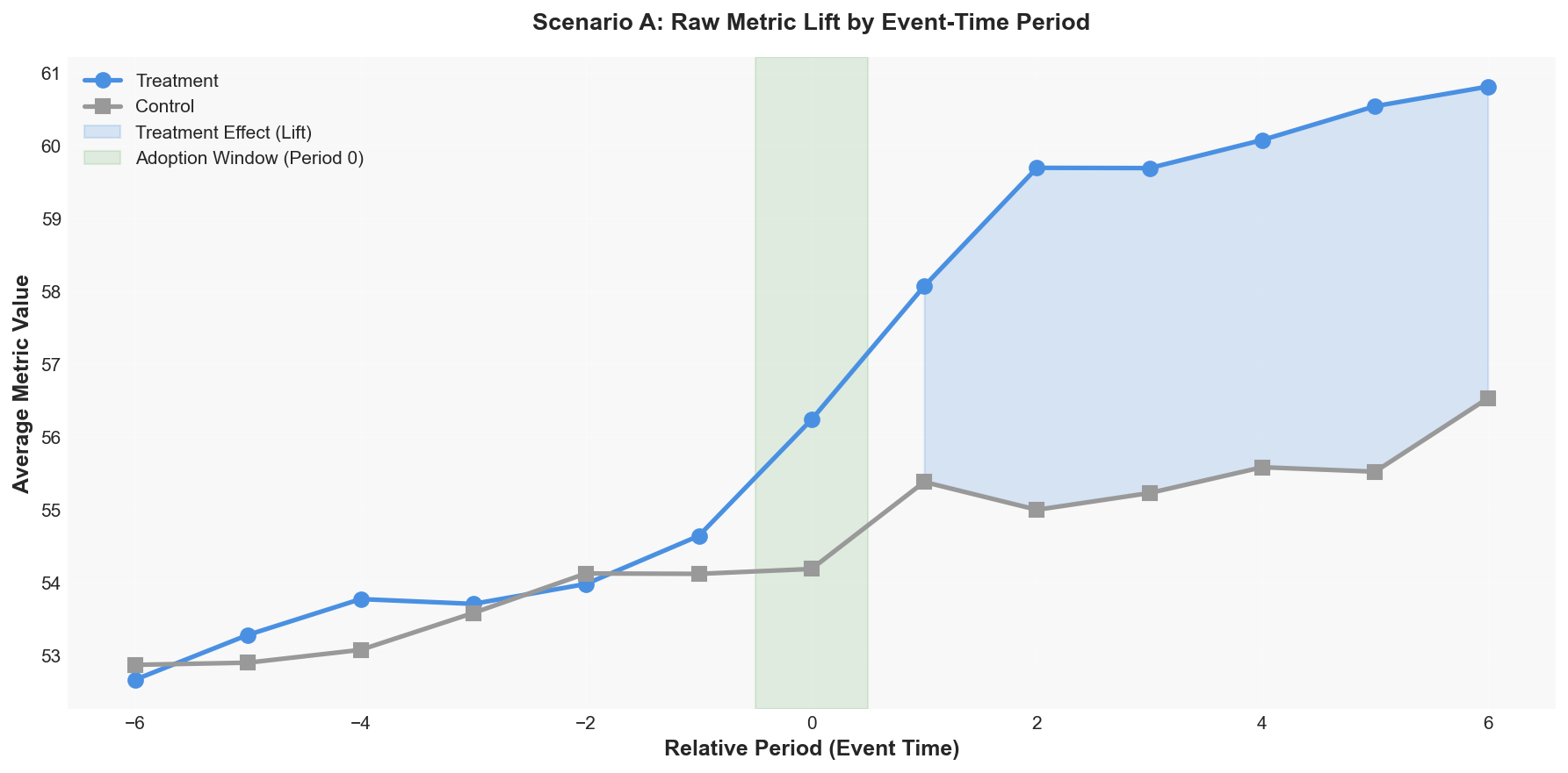 Average metric for treatment vs. control at each event-time period. The gap after Period 0 is the raw treatment effect. Both groups trend similarly in the pre-period, then diverge.
The gap between the two lines after Period 0 is the treatment effect in raw metric units. You can see it building over time as locations become more comfortable with the new software.
The raw lift shows the treatment effect in plain metric units, but it doesn’t control for location-level baseline differences or calendar-time trends. The event-study regression in the next section adds those controls, producing coefficients with confidence intervals that formally isolate the causal effect.
Event-Study Coefficients
The raw lift chart is useful, but it doesn’t control for anything. The event-study regression (details in the Appendix) formalizes this by running an OLS regression with location fixed effects (comparing each location to itself), time fixed effects (absorbing calendar-month shocks), and a set of treatment × period interaction terms. Each interaction term captures: “for treatment locations at this specific distance from adoption, how much higher is their metric than we’d expect given their own baseline and the calendar-month trend?”
The result is a regression coefficient at each relative period. A coefficient of +3.5 at Period +2 means: “two months after the adoption window closed, treatment locations’ metrics were 3.5 units higher than what we’d predict from their historical pattern and the control group’s concurrent trend.” If the model is well-specified, these coefficients isolate the causal effect of the treatment at each distance from adoption.
Behind the Math: How the Regression Isolates the Treatment Effect
The y = mx + b Version
The event-study regression is just y = mx + b with a more structured baseline. Here’s how each piece maps:
| y = mx + b | Event-Study | Plain English |
|---|---|---|
| y | $y_{it}$ | The metric you’re measuring for location i at time t |
| b (intercept) | $\alpha_i + \gamma_t$ | Predicted baseline without treatment. Two pieces: this location’s typical level ($\alpha_i$) + this month’s global trend ($\gamma_t$) |
| m (slope) | $\beta_k$ | Treatment effect at period k: how many extra metric units does treatment add at this distance from adoption? |
| x (variable) | $D_{ik}$ | A binary flag: “Is this location treated AND at relative period k?” (1 = yes, 0 = no) |
The one twist: instead of a single slope m, you get one per period. So the full equation is:
\[y_{it} = \underbrace{\alpha_i + \gamma_t}_{\text{baseline (b)}} + \underbrace{\beta_{-6} D_{-6} + \beta_{-5} D_{-5} + \cdots + \beta_{+6} D_{+6}}_{\text{treatment effects (m} \cdot \text{x, one per period)}} + \varepsilon_{it}\]Each $\beta_k$ is one dot on your event-study chart. Pre-period dots near zero mean the baseline prediction was accurate. Post-period dots climbing mean the treatment is working.
Plug-In Example
Say Location 7 has a typical baseline of 50 ($\alpha_7 = 50$), it’s currently Month 14 which has a global trend of +3 across all locations ($\gamma_{14} = 3$), and the regression estimated that the treatment effect at Period +2 is +4.1 ($\beta_{+2} = 4.1$). Location 7 is treated and currently 2 periods past adoption, so $D_{+2} = 1$:
\[y = \underbrace{50 + 3}_{\text{baseline}} + \underbrace{4.1 \times 1}_{\text{treatment at Period +2}} = 57.1\]Without treatment, we’d predict 53 (just the baseline). The observed 57.1 means 4.1 units of lift attributable to the treatment at this point in the post-period. For an untreated location at the same time, all the $D$ flags are 0, so the treatment terms drop out and the prediction is just $50 + 3 = 53$.
What Each Component Does
1. Location fixed effects ($\alpha_i$) — Each location has its own baseline level. Location A might average 60; Location B might average 45. The location fixed effect removes this “who you are” variation so we’re comparing each location to itself over time. Think of it like CUPED’s pre-period adjustment: instead of comparing raw levels across units, you’re looking at how much each location changed relative to its own history.
2. Time fixed effects ($\gamma_t$) — Each calendar month has its own average across all locations. Maybe December is always slow, or there’s a company-wide push in Q3 that lifts everyone. Time fixed effects absorb these calendar-driven patterns so they don’t get confused with treatment effects.
3. Treatment x period interactions ($\beta_k$) — After removing location baselines and calendar patterns, what’s left? For treated locations at each relative period $k$, the coefficient $\beta_k$ captures how much extra their metric moved beyond what the fixed effects alone would predict. This is the treatment effect at that specific distance from adoption.
The Code
# Event-study regression setup
# y_it = α_i + γ_t + Σ β_k · D_ik + ε_it

import pandas as pd
import statsmodels.api as sm

# Location fixed effects: compare each location to itself
loc_fe = pd.get_dummies(df['location_id'], drop_first=True)

# Time fixed effects: absorb calendar-month trends
time_fe = pd.get_dummies(df['calendar_month'], drop_first=True)

# Treatment × period indicators (one column per relative period)
# Only "on" for treated locations at that distance from adoption
treat_periods = pd.get_dummies(
    df['rel_period']
).multiply(df['treated'], axis=0)

X = pd.concat([loc_fe, time_fe, treat_periods], axis=1)
model = sm.OLS(df['metric'], sm.add_constant(X)).fit()

# β_k = coefficients on the treat_period columns
# Each one answers: "At period k relative to adoption,
# how much higher is the treated group's metric than
# the fixed effects alone would predict?"
The pre-period coefficients ($\beta_{-6}$ through $\beta_{-1}$) should land near zero. If they do, the model’s predicted baseline was accurate before treatment started. That’s what gives us confidence that the post-period coefficients are capturing a real treatment effect, not a pre-existing divergence.
What Negative Coefficients Tell You
In our simulation, the post-period coefficients are positive because the treatment works. But the regression doesn’t assume that. If $\beta_{+3} = -2.0$, it means treated locations are performing 2 units worse than the baseline predicts at that point. The treatment hurt.
The pre-period is where negative coefficients matter most. If you see $\beta_{-4} = -1.5$ (statistically significant), that’s a red flag: treatment locations were already diverging from control before adoption. Any post-period lift could be a continuation of that pre-existing trend rather than a real treatment effect. The whole framework depends on the pre-period being flat. If it isn’t, the estimate is suspect regardless of what the post-period shows.
| Coefficient Pattern | What It Means |
|---|---|
| Pre-period near zero, post-period positive | Treatment works. Baseline was accurate, post-period lift is real. |
| Pre-period near zero, post-period negative | Treatment backfired. The intervention made things worse. |
| Pre-period trending (positive or negative) | Parallel trends violated. Can’t trust the post-period estimate either way. |
| Pre-period near zero, post-period positive then fading | Treatment effect wears off over time. |
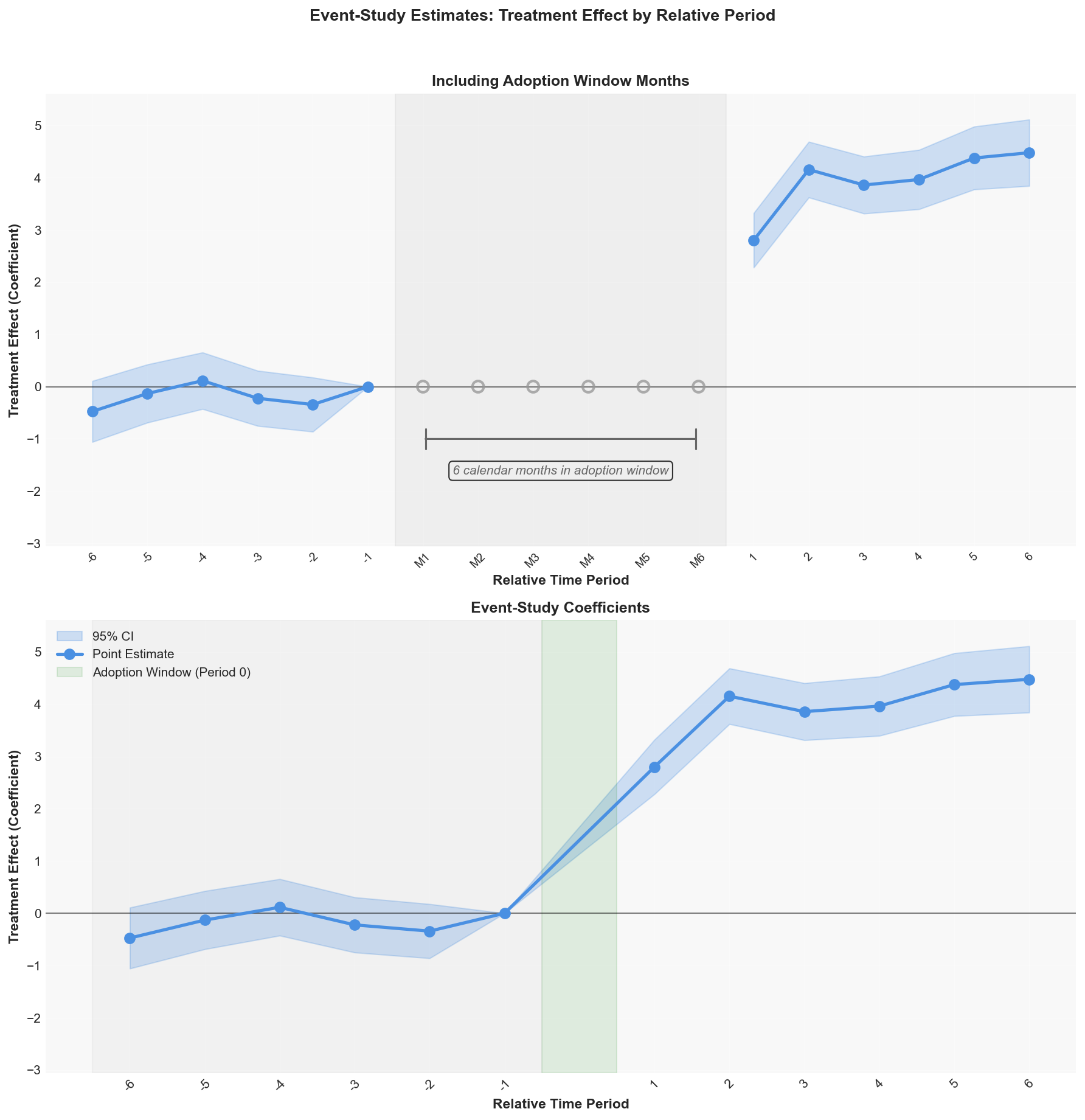 Top: the 6 calendar months that make up Period 0 shown individually (grayed out), showing data that gets excluded. Bottom: the final event-study coefficients with Period 0 condensed to a single band. Pre-period coefficients near zero confirm parallel trends. Post-period coefficients show the treatment effect building over time.
Pre-period (Periods -6 to -1): The coefficients hover near zero and their confidence intervals cross zero. This confirms treatment and control locations were trending the same way before adoption happened.
Post-period (Periods +1 to +6): The effect starts at about +2.8 in Period +1 and ramps up to about +4.5 by Period +6. This ramp-up pattern makes sense. It takes time for people to get comfortable with a new system.
Results
| Group | Pre-Period Avg | Post-Period Avg | Change |
|---|---|---|---|
| Treatment | 53.67 | 59.75 | +6.08 |
| Control | 53.44 | 55.54 | +2.10 |
| DiD Estimate | +3.98 |
The treatment group’s metric went up by 6.08. The control group also went up by 2.10 (background trend). The difference-in-differences strips out that background trend: 6.08 - 2.10 = 3.98 units attributable to the treatment.
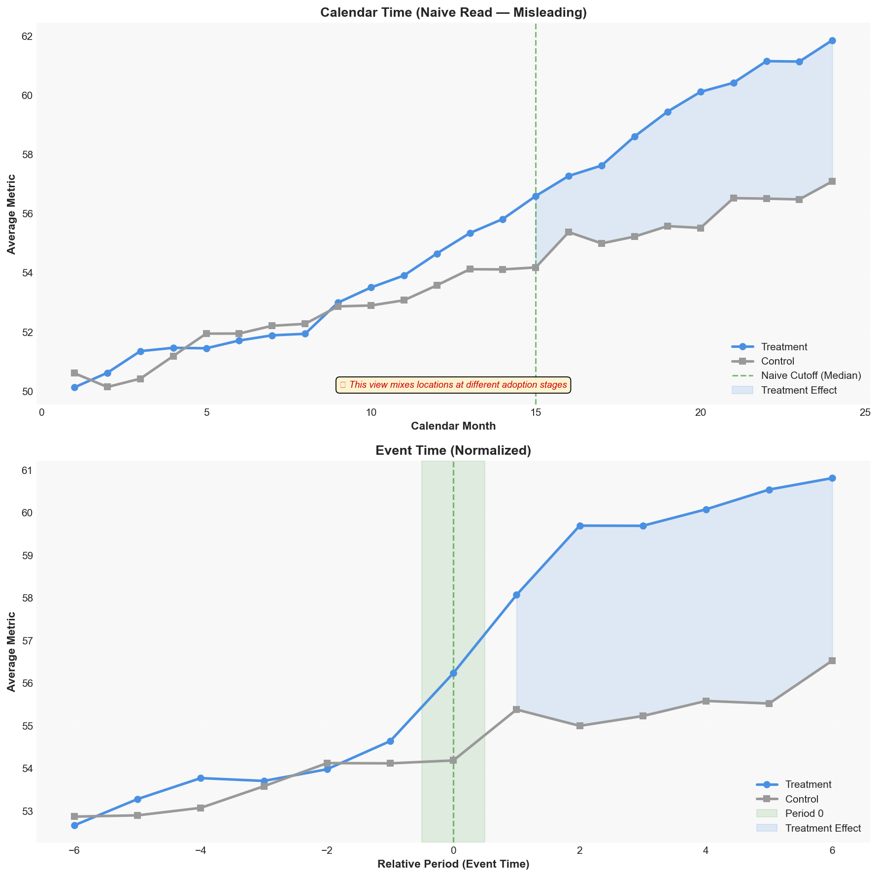 Top: The naive calendar-time view, splitting at the median adoption month. This is misleading because it mixes locations at different adoption stages. Bottom: After normalizing to event time, the treatment effect becomes crisp. The gap after Period 0 builds cleanly as locations settle into the new software.
Scenario B: Everyone Eventually Gets Treated
The Setup
The same normalization framework from Scenario A applies here. Each location still gets its own adoption window, pre-period, and post-period zones. The event-time alignment, the period-0 blackout, the sample filters: all of that carries over. The difference is in how we define the control group.
In practice, your control group doesn’t stay clean forever. Many real rollouts don’t have a permanent holdout. Leadership wants everyone on the new software eventually. Some locations also just start sooner than others.
This is the more common scenario and the one that’s harder to analyze. Every location gets treated. The question becomes: who do you compare the early adopters to?
The answer: locations that haven’t started yet. For each cohort of locations completing adoption in the same month, we define temporary controls as locations that haven’t even begun training by the end of that cohort’s analysis window. They’re “not yet treated” for the entire comparison window, so they serve as clean controls for that specific cohort.
| Cohort (completing month X) | Treatment | Temporary Control |
|---|---|---|
| Locations completing in Month 9 | Those locations | Locations whose training hasn’t started by Month 15 (leaves 6 months of post-period in the control) |
| Locations completing in Month 12 | Those locations | Locations whose training hasn’t started by Month 18 |
| Locations completing in Month 15 | Those locations | Locations whose training hasn’t started by Month 21 |
As more locations adopt, the pool of available control units shrinks. Early cohorts have plenty of not-yet-treated locations to compare against. Late cohorts have fewer. This is a fundamental constraint, not a flaw.
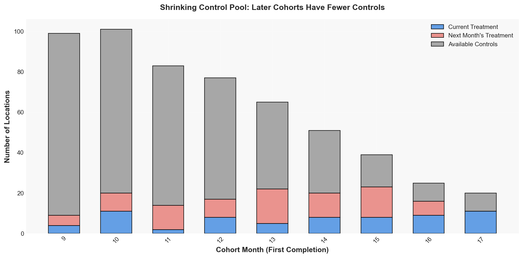 For each cohort month: blue = current treatment locations, red = locations about to start treatment next month (being “shaved off” from the control pool), gray = remaining available controls. The control pool visibly shrinks as adoption progresses.
Deep Dive: Why Two-Way Fixed Effects (TWFE) Fails Here
Two-Way Fixed Effects (TWFE) is the standard regression approach for panel data. The idea is simple: include a fixed effect for each location (absorbing permanent differences between units) and one for each time period (absorbing shocks that hit everyone). Then add a single binary treatment indicator, run OLS, and read off its coefficient. For a primer on panel data methods, Torres (2007) is a solid starting point.
When everyone gets treated at the same time, TWFE works great. There’s one clean “before” and one clean “after.” The untreated locations serve as a straightforward comparison group the entire time.
The problem shows up when adoption is staggered. Consider two locations:
- Location A adopted in Month 6. By Month 14, it’s been on the new software for 8 months and its metric is elevated.
- Location B adopted in Month 12. By Month 14, it’s only 2 months in.
TWFE compares Location B’s post-treatment metric against all other units at that time, including Location A. But Location A’s metric is already inflated by 8 months of treatment. TWFE treats it as a valid comparison anyway. This pulls Location B’s estimated effect downward.
If the treatment effect is constant over time, this contamination is minor. But if the effect ramps up (as it does in most real rollouts, where people gradually get more comfortable with a new system), the bias grows. Early adopters in their late post-period have large accumulated effects. When TWFE implicitly uses them as “controls” for late adopters, it subtracts those large effects, shrinking or even flipping the estimated coefficient.
Callaway and Sant’Anna (2021) and Sun and Abraham (2021) formalized this problem and showed just how misleading those estimates can be when treatment effects evolve over time.
Beyond the statistical issues, event-study designs have a practical advantage: they produce period-by-period estimates that are easy to explain to business stakeholders. Showing a chart where the effect ramps up over time tells a story that a single TWFE coefficient can’t. This is what we want to build upon: estimate treatment effects cohort by cohort, using only not-yet-treated units as our control group.
Results
Using the cohort-based approach on simulated data where all 200 locations eventually get treated:
| Group | Pre-Period Avg | Post-Period Avg | Change |
|---|---|---|---|
| Treatment (cohort) | 53.02 | 59.27 | +6.24 |
| Control (not-yet-treated) | 52.49 | 54.57 | +2.08 |
| DiD Estimate | +4.16 |
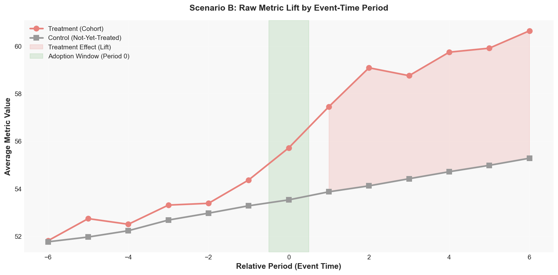 Average metric for cohort-defined treatment vs. temporary controls at each event-time period. The gap after Period 0 is the raw treatment effect, measured against locations that haven’t started training yet.
The raw lift is visible but noisier than Scenario A. The regression coefficients below add location, time, and cohort fixed effects for a cleaner read.
Behind the Math: How Cohort-Based Regression Differs
The regression structure is the same as Scenario A, with one addition: cohort fixed effects. Each adoption cohort (locations completing in the same month) gets its own intercept. This helps us compare within cohorts: early adopters against their own temporary controls, late adopters against theirs.
The practical effect: instead of one big regression pooling all locations together, the cohort fixed effects effectively run separate comparisons for each adoption wave and average across them. This prevents early adopters’ elevated metrics from contaminating late adopters’ estimates, the exact problem that TWFE has.
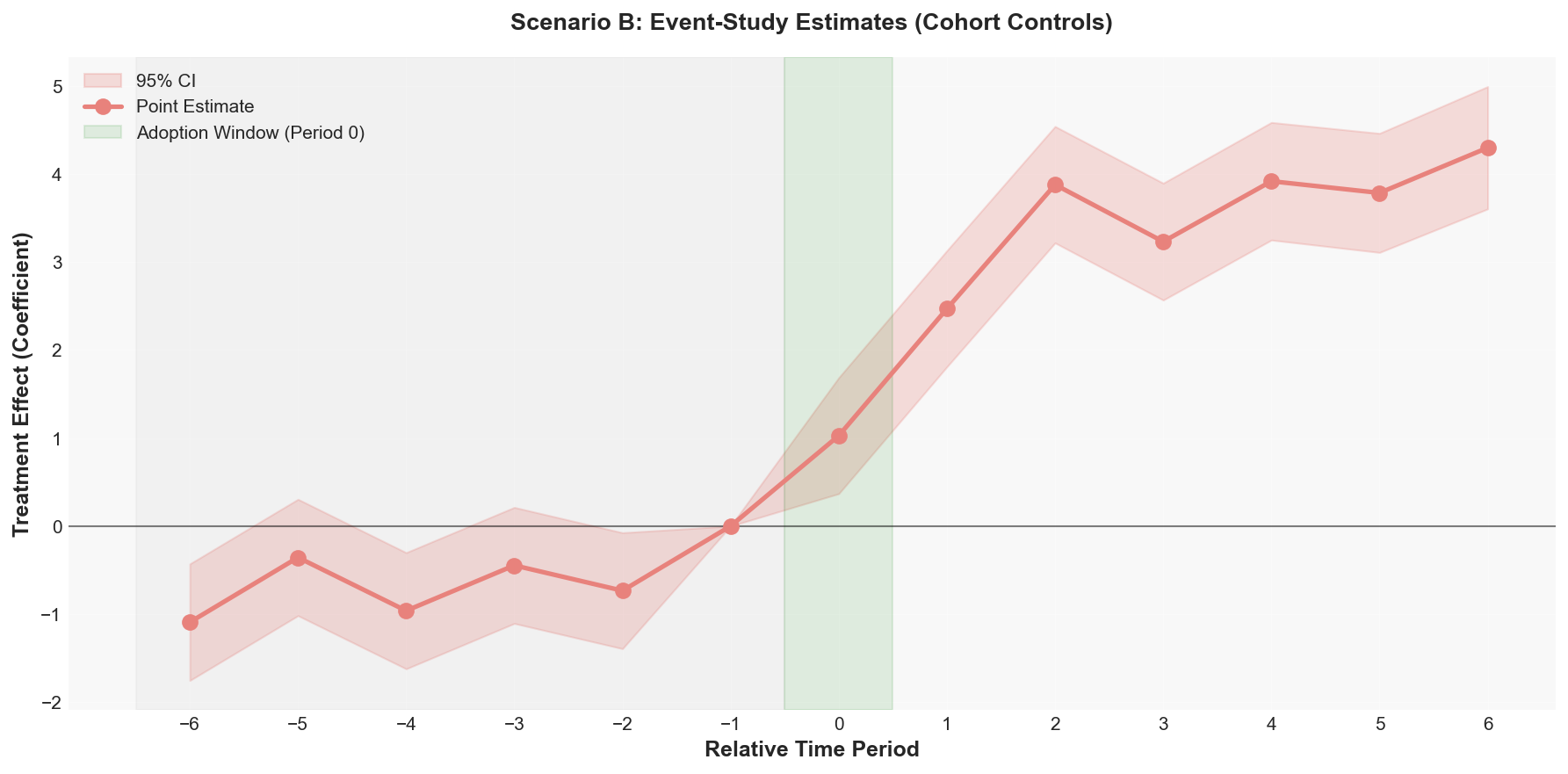 Event-study coefficients for Scenario B using cohort-defined temporary controls. The pattern is similar to Scenario A: flat pre-period, positive post-period ramp-up. Confidence intervals are wider because the effective control group is smaller.
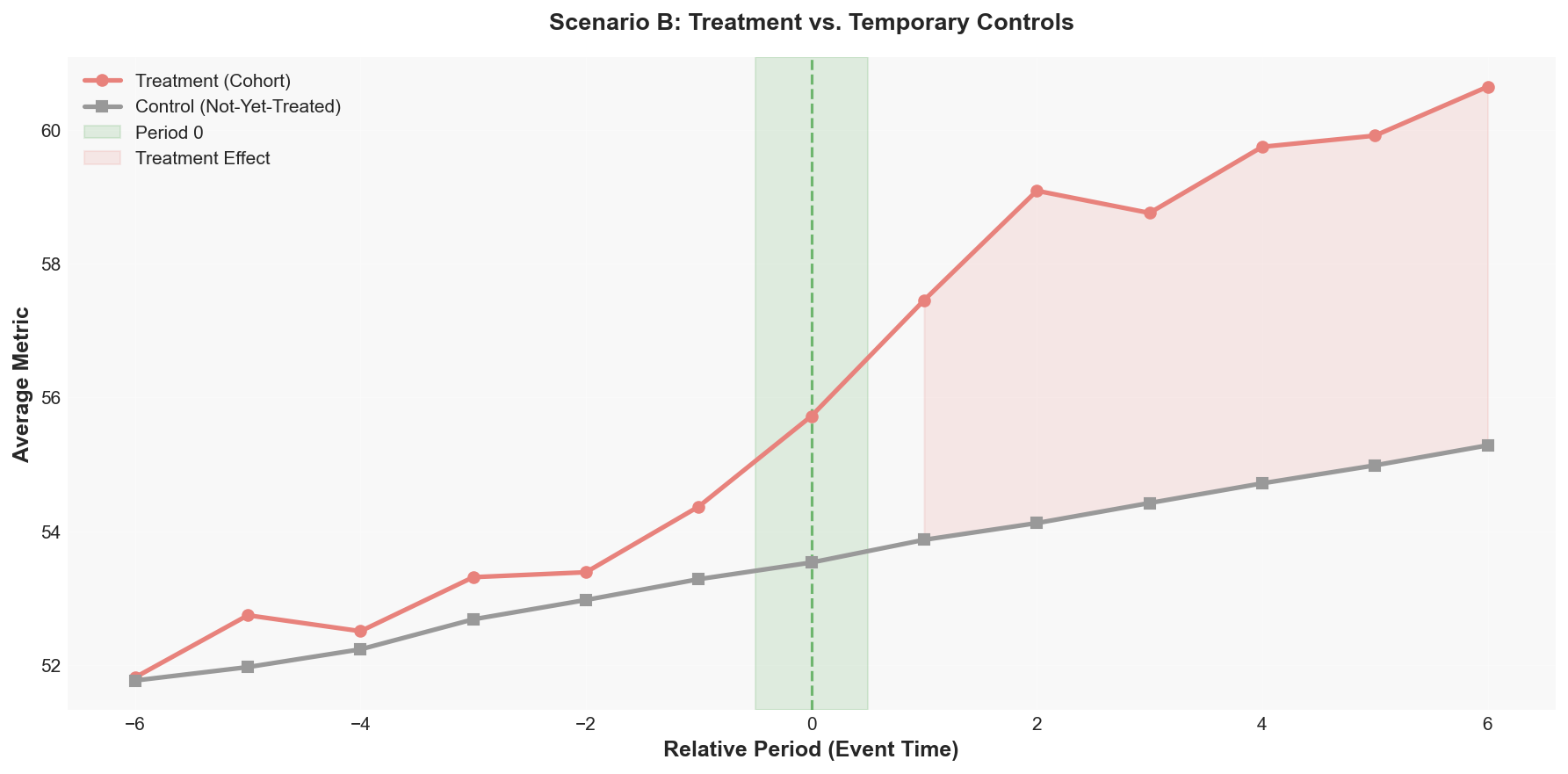 Treatment vs. temporary controls in event time. The gap after Period 0 shows the treatment effect, measured against locations that haven’t started training yet.
The estimate recovers the signal, but with wider confidence intervals than Scenario A. That’s expected, and it’s worth understanding why.
Why the Confidence Intervals Are Wider
A confidence interval tells you the range of values that are plausible given your data. A 95% CI means: if you repeated this experiment many times with new random samples, about 95% of the intervals you’d compute would contain the true effect. Narrower intervals mean more precision. Wider intervals mean more uncertainty.
In Scenario A, the control group is fixed: the same 80 locations serve as the comparison for every treatment location across the entire timeline. That’s a lot of data anchoring the control group average, which keeps variance low and intervals tight.
In Scenario B, each cohort defines its own temporary control group. A cohort completing in Month 9 might have 40 controls (locations that haven’t started by Month 15). A cohort completing in Month 15 might only have 15 controls (most locations have started by then). Fewer control units means more variance in the control group average for that cohort, which translates to wider intervals on that cohort’s estimate. The final estimate pools across all cohorts, but it inherits the noise from the noisier ones. The precision you lose is the cost of not having a permanent holdout, and it’s a real tradeoff.
Comparing the Two Scenarios
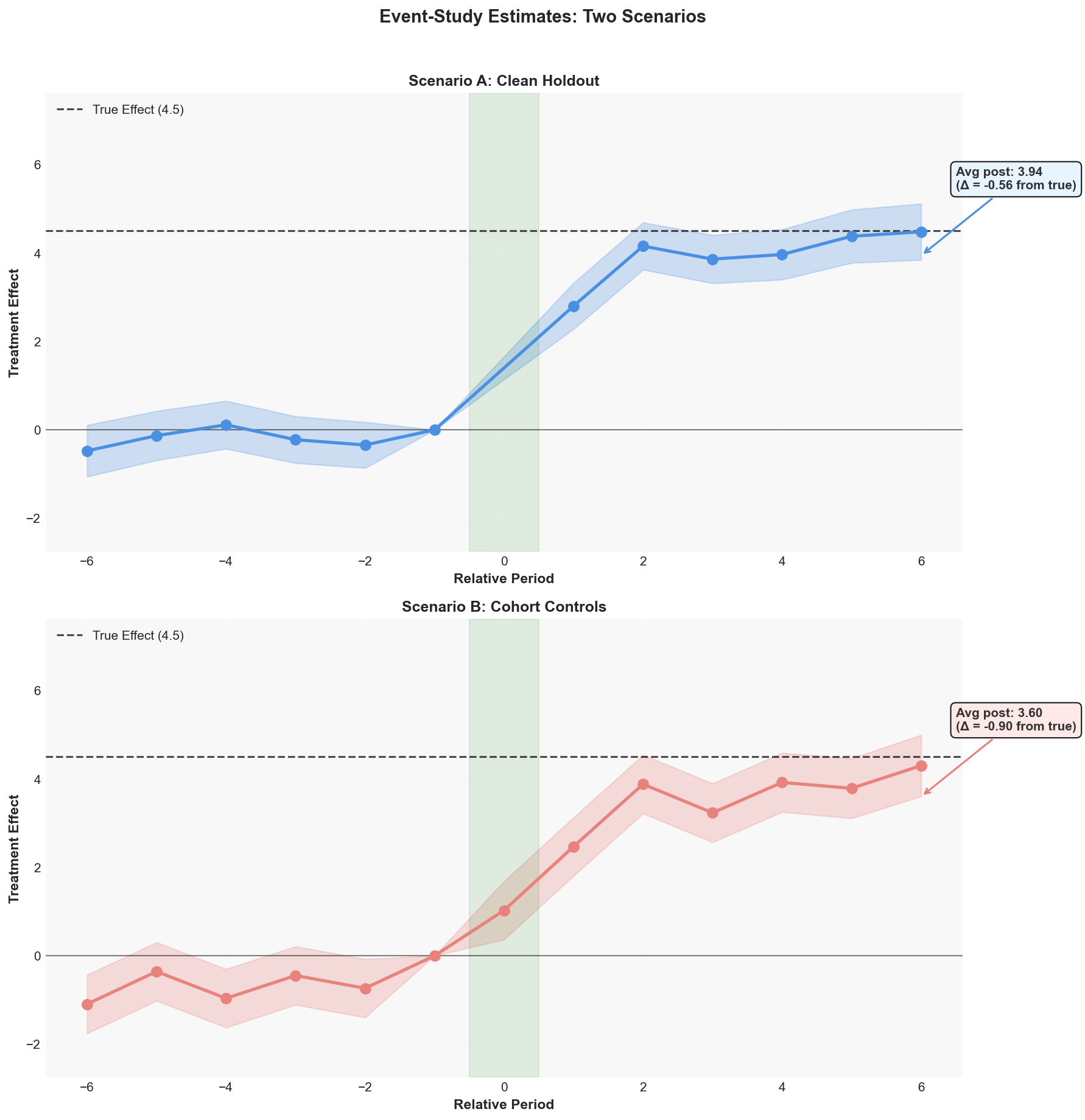 Side by side: Scenario A (clean holdout, blue) vs Scenario B (cohort controls, red). The dashed line marks the true effect built into the simulation (4.5). Both recover the signal. Scenario A has tighter confidence intervals because the control group is larger and permanent.
Why some methods fall short
This is why framework matters. We ran the same simulated data through three different estimation approaches to see how much the choice of method affects the result. Since this is synthetic data, we know the true treatment effect built into the simulation (4.5 units at full ramp-up), so we can measure how far off each approach lands.
Approach A: Naive Calendar Cutoff
Pick the median adoption month, split everything into “before” and “after,” compare treatment to control. This is the simplest possible approach and what most people try first. It systematically underestimates because at any given calendar month, your treatment group includes locations at completely different stages. You’re averaging together real effects with zeros.
Approach B: Standard TWFE
Run a single regression with location fixed effects, time fixed effects, and one treatment indicator. Unlike the naive approach, this uses each location’s actual adoption date to define “post-treatment.” That’s better than forcing a single cutoff. But it still pools into one average effect, and under staggered timing, already-treated locations implicitly serve as comparisons for late adopters.
Approach C: Event-Study Design
The approach we’ve been building throughout this post. By normalizing each location to its own event time and estimating period-by-period effects, we avoid the composition bias that plagues the other two methods.
The Comparison
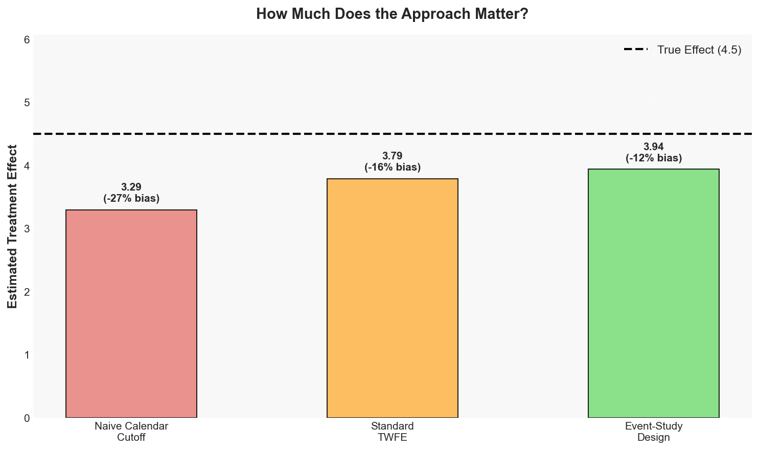 The naive calendar cutoff underestimates by about 27%. Standard TWFE closes to about 16% off. The event-study design lands closest, within 12% of the known average treatment effect across all post-periods.
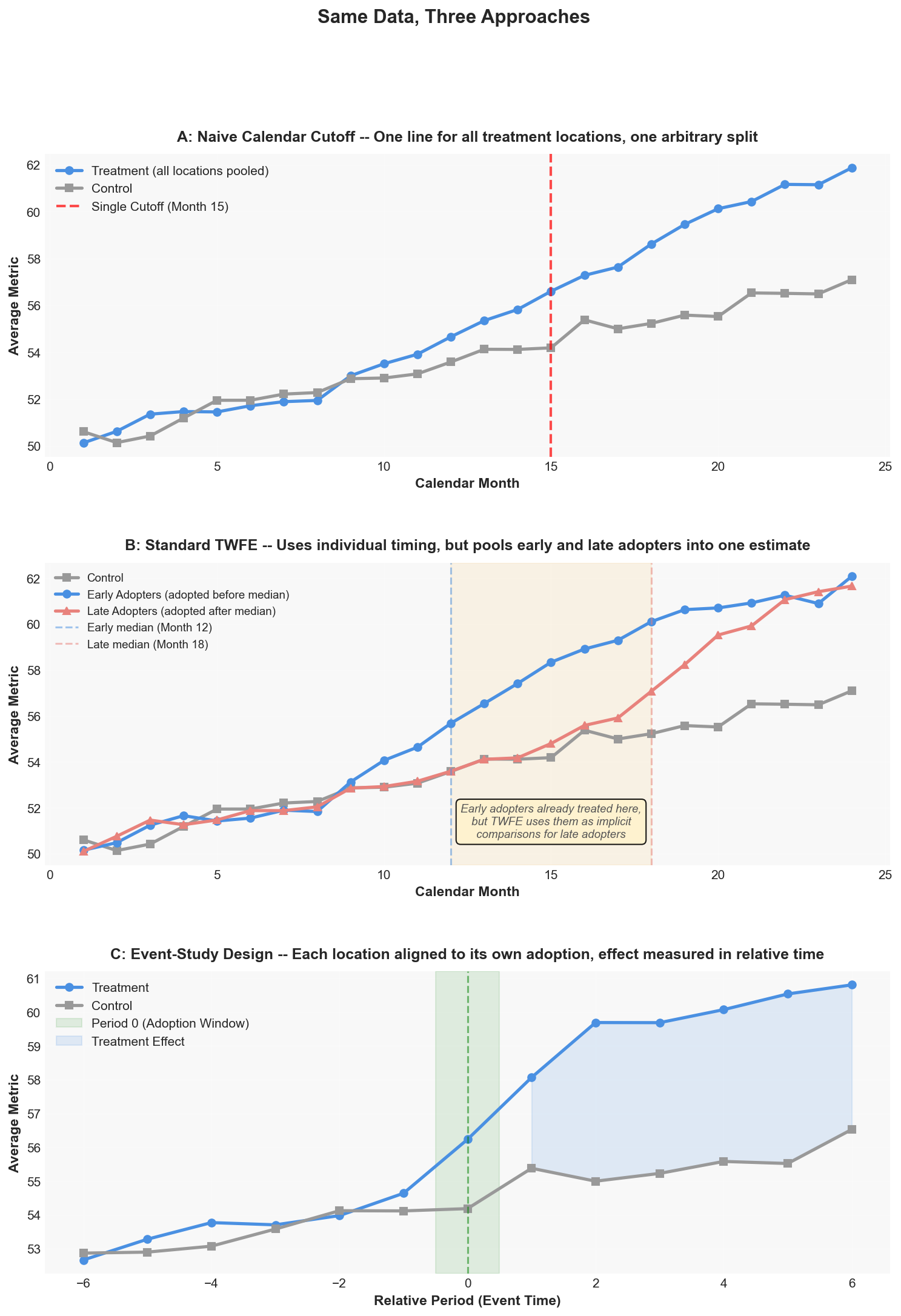 Same data, three approaches. Panel A uses a single calendar cutoff. Panel B splits treatment into early and late adopters, showing the heterogeneity that TWFE pools into one number. Panel C normalizes to event time, where the treatment effect snaps into focus.
The takeaway: the choice of analytical framework isn’t just an academic exercise. On this data, the naive approach underestimated the average treatment effect by about 27%. If you presented that to leadership, you’d be telling them the intervention was significantly less effective than it actually was. The event-study design recovers most of the signal.
Try It Yourself
Adjust the parameters below and hit “Run Simulation” to see how staggered adoption affects each estimation method. The simulation generates synthetic data with your chosen settings and compares three approaches: naive calendar cutoff, TWFE, and event-study design.
Try setting the stagger range to 1 month (everyone adopts at roughly the same time) and watch all three methods converge. Then crank it up to 15 months and see the naive estimate fall behind.
Limitations
No approach covers everything. Here’s what to watch for.
Pre-Period Contamination
Some trainees are already in training during the pre-period months. If training itself disrupts operations (trainee pulled away for classes, other staff covering, workload shifting), then the pre-period metrics might be slightly depressed compared to a truly untouched baseline. This actually biases your estimate downward: the pre-period looks worse than it would without any training disruption, so the measured lift is smaller than the real lift. If you find a positive effect despite this, the true effect is probably larger.
Selection Bias from Filtering
By filtering to locations with clean adoption windows and sufficient data, we’re studying a specific subset. Locations that adopted within the expected timeframe might have had smoother operations or stronger management support. The treatment effect for those locations could be higher than what you’d see for locations that had a harder time with adoption. The result speaks to locations that implemented properly, which is still a very useful answer in a lot of business contexts, just not a universal one.
Parallel Trends
This is the core assumption behind the whole framework. Treatment and control locations need to have been following the same trajectory before adoption. If they weren’t, any post-adoption divergence could be driven by something other than the treatment. We can check this in the pre-period by looking at whether the two groups were trending together. We can’t prove it holds in the post-period, but if the pre-trends align closely, that’s strong supporting evidence.
Scenario B: Shrinking Controls
In Scenario B, the pool of available controls shrinks as more locations adopt. Late cohorts have fewer not-yet-treated locations to compare against, which means wider confidence intervals and less statistical power. If adoption is fast enough that almost everyone is treated within a few months, there may not be enough clean controls for any cohort.
When to Use Something Else
This approach works well when you have treatment timing that varies, you can define a bounded adoption window, you have enough pre and post periods, and the parallel trends assumption is plausible. Consider alternatives when you don’t have a control group (synthetic control methods), when treatment is continuous rather than binary (dose-response models), when adoption timing is endogenous (instrumental variables), or when you have very few treated units.
Summary
When treatment timing varies, standard DiD breaks. Forcing a single cutoff creates composition bias that can dilute or reverse your results.
The fix: normalize to event time. Let each unit define its own adoption window, black out the transition, and measure outcomes relative to each unit’s timeline. The event-study regression gives you period-by-period effects with built-in validation through the flat pre-period test.
Two scenarios, same framework. Clean holdout (Scenario A) gives tighter estimates. Everyone-gets-treated (Scenario B) uses cohort-based temporary controls and is more common in practice. The adoption window threshold is a judgment call, filtering trades sample size for cleaner reads, and parallel trends is the assumption that matters most.
References
- Callaway, B., & Sant’Anna, P. H. (2021). Difference-in-Differences with multiple time periods. Journal of Econometrics, 225(2), 200-230. Link
- Sun, L., & Abraham, S. (2021). Estimating dynamic treatment effects in event studies with heterogeneous treatment effects. Journal of Econometrics, 225(2), 175-199. Link
- Goodman-Bacon, A. (2021). Difference-in-differences with variation in treatment timing. Journal of Econometrics, 225(2), 254-277. Link
Appendix: The Formal Model
Event-Study Regression Specification
The event-study regression formalizes the period-by-period DiD comparison. The model:
\[Y_{it} = \alpha_i + \gamma_t + \sum_{k \neq -1} \beta_k \cdot D_{it}^{k} + \epsilon_{it}\]Here is what each piece means in plain language.
$Y_{it}$ is the efficiency metric for location $i$ in month $t$.
$\alpha_i$ is a location fixed effect. Each location is compared to itself. Location 101 might naturally run at a higher efficiency than Location 205. The fixed effect absorbs that difference. We’re not comparing Location 101 to Location 205. We’re comparing Location 101 before adoption to Location 101 after adoption.
$\gamma_t$ is a time fixed effect. This absorbs anything that affected all locations in a given month. Maybe December is always slower because of holidays. Maybe there was a system outage in Month 14 that hit everyone. Time fixed effects soak that up.
$D_{it}^{k}$ is a dummy variable equal to 1 if location $i$ is a treatment location and is in relative period $k$. This is how we isolate the treatment effect at each specific distance from adoption.
$\beta_k$ is what we care about. These are the treatment effect coefficients. $\beta_{+3}$ tells us: “three months after the adoption window closed, how much higher (or lower) was the metric for treatment locations compared to what we’d expect?”
We omit Period -1 as the reference category. All other $\beta_k$ values are measured relative to the period right before adoption started completing. This gives us a built-in sanity check: the pre-period betas should be near zero.
For Scenario B, the model adds cohort fixed effects ($\delta_c$) to account for systematic differences across adoption cohorts, and uses cohort-specific treatment/control definitions rather than a permanent control group.
Appendix: Full Code
The complete simulation is below. It generates synthetic panel data for both scenarios, normalizes to event time, runs the event-study regression, and benchmarks against naive and TWFE approaches. You can also download the script which includes all plotting functions.
pip install numpy pandas matplotlib statsmodels seaborn
python staggered_did_simulation.py
1. Generate Synthetic Panel Data (Scenario A)
import numpy as np
import pandas as pd
import statsmodels.api as sm

np.random.seed(42)

def generate_synthetic_data():
    """
    Create a panel dataset of 200 locations over 24 months.
    120 treatment locations adopt new software on staggered
    timelines. 80 control locations never adopt.

    Treatment effect: ramps up over 3 months post-adoption,
    peaking at 4.5 units (3 months * 1.5 per month).
    """
    records = []

    # --- Treatment locations (IDs 1 through 120) ---
    for loc_id in range(1, 121):
        # Each location starts adoption in a random month
        adoption_start = np.random.randint(3, 16)

        # 1-5 employees per location
        n_employees = np.random.randint(1, 6)

        # 40% train everyone together, 60% stagger
        if np.random.random() < 0.4:
            starts = [adoption_start] * n_employees
        else:
            spread = np.random.randint(1, 4)
            starts = [
                adoption_start + np.random.randint(0, spread)
                for _ in range(n_employees)
            ]

        # Training takes 6 months per person
        completions = [s + 6 for s in starts]
        first_completion = min(completions)
        last_completion = max(completions)
        window = last_completion - first_completion

        # Skip locations with adoption windows > 6 months
        if window > 6:
            continue

        for month in range(1, 25):
            # Baseline metric with trend and noise
            baseline = 50 + 0.3 * month
            noise = np.random.normal(0, 2)

            # Treatment effect ramps up after first completion
            effect = 0
            if month >= first_completion:
                months_post = min(
                    month - first_completion + 1, 3
                )
                effect = months_post * 1.5

            records.append({
                'location_id': loc_id,
                'month': month,
                'metric': baseline + effect + noise,
                'treatment': 1,
                'first_completion': first_completion,
                'last_completion': last_completion,
                'adoption_window': window,
            })

    # --- Control locations (IDs 121 through 200) ---
    for loc_id in range(121, 201):
        for month in range(1, 25):
            baseline = 50 + 0.3 * month
            noise = np.random.normal(0, 2)

            records.append({
                'location_id': loc_id,
                'month': month,
                'metric': baseline + noise,
                'treatment': 0,
                'first_completion': np.nan,
                'last_completion': np.nan,
                'adoption_window': np.nan,
            })

    return pd.DataFrame(records)
2. Normalize to Event Time
def normalize_to_event_time(data):
    """
    Convert calendar time to relative event time.

    Treatment locations: event_time = month - first_completion
      Period -3 = three months before first trainee finished
      Period  0 = month of first completion (adoption window)
      Period +2 = two months after last trainee finished

    Control locations: aligned to median treatment timing
    for visualization purposes. The regression uses time
    fixed effects for the actual comparison.
    """
    median_adoption = data.loc[
        data['treatment'] == 1, 'first_completion'
    ].median()

    data['event_time'] = np.nan
    data['period'] = np.nan

    # Treatment: relative to their own first_completion
    treat = data['treatment'] == 1
    data.loc[treat, 'event_time'] = (
        data.loc[treat, 'month']
        - data.loc[treat, 'first_completion']
    )

    # Control: relative to median adoption time
    ctrl = data['treatment'] == 0
    data.loc[ctrl, 'event_time'] = (
        data.loc[ctrl, 'month'] - median_adoption
    )

    # Bin into periods -6 through +6
    in_window = data['event_time'].between(-6, 6)
    data.loc[in_window, 'period'] = (
        data.loc[in_window, 'event_time'].astype(int)
    )

    return data
3. Event-Study Regression
def run_event_study_regression(data):
    """
    Estimate treatment effects at each relative period.

    Model: Y_it = alpha_i + gamma_t + sum(beta_k * D_it^k)

    D_it^k = 1 if location i is treated AND in period k.
    Period -1 is the omitted reference category.
    Pre-period betas near zero = parallel trends confirmed.
    Post-period betas = treatment effect at each distance.
    """
    reg_data = data[
        data['period'].notna()
        & (data['period'] >= -6)
        & (data['period'] <= 6)
    ].copy()

    # Treatment x period interaction dummies
    # Each one isolates the treatment effect at period k
    for k in range(-6, 7):
        reg_data[f'period_{k}'] = (
            (reg_data['period'] == k)
            & (reg_data['treatment'] == 1)
        ).astype(int)

    # Drop period -1 (reference category)
    reg_data = reg_data.drop(columns=['period_-1'])

    # Fixed effects
    loc_fe = pd.get_dummies(
        reg_data['location_id'],
        prefix='loc', drop_first=True
    )
    time_fe = pd.get_dummies(
        reg_data['month'],
        prefix='month', drop_first=True
    )

    # Build regression matrix
    period_cols = [
        f'period_{k}' for k in range(-6, 7) if k != -1
    ]
    X = pd.concat(
        [reg_data[period_cols], loc_fe, time_fe], axis=1
    ).astype(float)
    X = sm.add_constant(X, has_constant='add')
    Y = reg_data['metric'].astype(float)

    results = sm.OLS(Y, X).fit()

    # Extract coefficients for each period
    coefs, ci_lo, ci_hi = {}, {}, {}
    for k in range(-6, 7):
        if k == -1:
            coefs[k], ci_lo[k], ci_hi[k] = 0, 0, 0
            continue
        col = f'period_{k}'
        coefs[k] = results.params[col]
        ci = results.conf_int().loc[col]
        ci_lo[k], ci_hi[k] = ci[0], ci[1]

    return results, coefs, ci_lo, ci_hi
4. Scenario B: Cohort-Based Controls
def generate_scenario_b_data(n_locations=200, n_months=30):
    """
    All locations eventually get treated. No permanent control.
    Adoption starts staggered across months 3-24.
    Longer timeline (30 months) for late adopters.
    """
    np.random.seed(42)
    records = []

    for loc_id in range(1, n_locations + 1):
        adoption_start = np.random.randint(3, 25)
        n_employees = np.random.randint(1, 6)

        if np.random.random() < 0.4:
            starts = [adoption_start] * n_employees
        else:
            spread = np.random.randint(1, 4)
            starts = [
                adoption_start + np.random.randint(0, spread)
                for _ in range(n_employees)
            ]

        completions = [s + 6 for s in starts]
        first_completion = min(completions)
        last_completion = max(completions)
        window = last_completion - first_completion

        if window > 6:
            continue

        for month in range(1, n_months + 1):
            baseline = 50 + 0.3 * month
            noise = np.random.normal(0, 2)
            effect = 0
            if month >= first_completion:
                months_post = min(
                    month - first_completion + 1, 3
                )
                effect = months_post * 1.5

            records.append({
                'location_id': loc_id,
                'month': month,
                'metric': baseline + effect + noise,
                'first_completion': first_completion,
                'adoption_start': adoption_start,
            })

    return pd.DataFrame(records)


def define_cohort_controls(data, pre_periods=6,
                           post_periods=6):
    """
    For each cohort (locations completing in the same month),
    define temporary controls: locations that haven't started
    treatment by the end of this cohort's analysis window.
    """
    all_cohort_data = []
    cohort_months = sorted(
        data['first_completion'].dropna().unique()
    )

    for cm in cohort_months:
        cm = int(cm)
        cohort_ids = data[
            data['first_completion'] == cm
        ]['location_id'].unique()

        window_end = cm + post_periods
        control_ids = data[
            data['adoption_start'] > window_end
        ]['location_id'].unique()

        if len(control_ids) < 3:
            continue

        window_start = cm - pre_periods
        for loc_id in cohort_ids:
            ld = data[
                (data['location_id'] == loc_id)
                & (data['month'].between(window_start,
                                         window_end))
            ].copy()
            ld['cohort'] = cm
            ld['cohort_treatment'] = 1
            fc = ld['first_completion'].iloc[0]
            ld['event_time'] = ld['month'] - fc
            ld['period'] = np.where(
                ld['event_time'].between(-pre_periods,
                                         post_periods),
                ld['event_time'].astype(int), np.nan
            )
            all_cohort_data.append(ld)

        for loc_id in control_ids:
            ld = data[
                (data['location_id'] == loc_id)
                & (data['month'].between(window_start,
                                         window_end))
            ].copy()
            ld['cohort'] = cm
            ld['cohort_treatment'] = 0
            ld['event_time'] = ld['month'] - cm
            ld['period'] = np.where(
                ld['event_time'].between(-pre_periods,
                                         post_periods),
                ld['event_time'].astype(int), np.nan
            )
            all_cohort_data.append(ld)

    return pd.concat(all_cohort_data, ignore_index=True)
5. DiD Summary and Benchmarking
def compute_did_summary(data):
    """
    Simple DiD table: pre/post averages for treatment
    and control. Pre = periods -6 to -1, post = +1 to +6.
    """
    analysis = data[
        data['period'].notna() & (data['period'] != 0)
    ].copy()
    analysis['post'] = (analysis['period'] > 0).astype(int)

    summary = analysis.groupby(
        ['treatment', 'post']
    )['metric'].mean().unstack()
    summary.columns = ['Pre Avg', 'Post Avg']
    summary['Change'] = summary['Post Avg'] - summary['Pre Avg']
    summary.index = ['Control', 'Treatment']

    did = (
        summary.loc['Treatment', 'Change']
        - summary.loc['Control', 'Change']
    )
    print(f"DiD Estimate: {did:.2f}")
    return summary, did


def run_naive_cutoff(data):
    """
    Naive approach: single calendar cutoff at the median
    adoption month. Splits all data into before/after.
    Underestimates because of composition bias.
    """
    cutoff = int(
        data.loc[data['treatment'] == 1, 'first_completion']
        .median()
    )
    pre = data[data['month'] < cutoff]
    post = data[data['month'] >= cutoff]

    treat_change = (
        post[post['treatment'] == 1]['metric'].mean()
        - pre[pre['treatment'] == 1]['metric'].mean()
    )
    ctrl_change = (
        post[post['treatment'] == 0]['metric'].mean()
        - pre[pre['treatment'] == 0]['metric'].mean()
    )
    return treat_change - ctrl_change


def run_twfe(data):
    """
    Two-way fixed effects: single treatment coefficient.
    Uses each location's actual adoption date (better than
    naive), but still pools into one average effect.
    Under staggered timing, already-treated locations
    implicitly serve as comparisons for late adopters.
    """
    cutoff = int(
        data.loc[data['treatment'] == 1, 'first_completion']
        .median()
    )
    reg = data.copy()

    # Treatment locations: post = after THEIR adoption
    treat = reg['treatment'] == 1
    reg.loc[treat, 'post'] = (
        reg.loc[treat, 'month']
        >= reg.loc[treat, 'first_completion']
    ).astype(int)

    # Control locations: post = after median cutoff
    ctrl = reg['treatment'] == 0
    reg.loc[ctrl, 'post'] = (
        reg.loc[ctrl, 'month'] >= cutoff
    ).astype(int)

    reg['treat_x_post'] = reg['treatment'] * reg['post']

    # Fixed effects
    loc_fe = pd.get_dummies(
        reg['location_id'], prefix='loc', drop_first=True
    )
    time_fe = pd.get_dummies(
        reg['month'], prefix='month', drop_first=True
    )

    X = pd.concat(
        [reg[['treat_x_post']], loc_fe, time_fe], axis=1
    ).astype(float)
    X = sm.add_constant(X, has_constant='add')
    Y = reg['metric'].astype(float)

    model = sm.OLS(Y, X).fit()
    return model.params['treat_x_post']


# --- Run everything ---
data = generate_synthetic_data()
data = normalize_to_event_time(data)

results, coefs, ci_lo, ci_hi = run_event_study_regression(data)
summary, did = compute_did_summary(data)

naive = run_naive_cutoff(data)
twfe = run_twfe(data)
event_study_avg = np.mean([coefs[k] for k in coefs if k > 0])
true_effect = 4.5  # Built into the simulation

print(f"\nNaive:       {naive:.2f} ({((naive-true_effect)/true_effect)*100:+.0f}% bias)")
print(f"TWFE:        {twfe:.2f} ({((twfe-true_effect)/true_effect)*100:+.0f}% bias)")
print(f"Event-Study: {event_study_avg:.2f} ({((event_study_avg-true_effect)/true_effect)*100:+.0f}% bias)")
print(f"True Effect: {true_effect}")
Uses np.random.seed(42) for reproducibility. The full script includes all plotting functions and the Scenario B simulation.