Measuring Urbanicity with Hospital Data: A Distance-Based Approach
How do you measure how “urban” an area is without census data? Here’s one approach: look at where the hospitals are.
Introduction
If you ask someone whether New York City is “urban,” they’ll say yes without hesitation. But what about Orlando? Kansas City? Rochester? As a percentage, how urban are these places?
There’s no single right answer. “Urbanicity” is fuzzy. Census definitions exist, but they’re based on administrative boundaries that don’t always match reality. Population density helps, but a suburban apartment complex might have higher density than a small downtown.
This project explores a different proxy: hospital locations.
The hypothesis is simple. Hospitals are expensive to build and maintain. They only exist where there’s enough population to support them. So the distance between hospitals tells us something about the population density between them.
What we’ll build:
- A distance matrix between all hospitals in the US
- A classification scheme based on hospital proximity
- An improved method using k-nearest neighbors
- Maps comparing the two approaches
The Hypothesis
If two hospitals are 30 miles apart, we can infer there isn’t enough population between them to justify building another hospital. If they’re 300 meters apart, we’re probably in a dense urban core.
By measuring the distances between hospitals and clustering them, we might be able to create an “urbanicity score” that reflects reality better than arbitrary administrative boundaries.
This won’t be perfect. But it might be useful.
The Data
Hospital location data is available from the HIFLD Open Data portal. The dataset includes over 7,000 hospitals with latitude/longitude coordinates, bed counts, facility type, and operational status.
library(tidyverse)
library(ggmap)      # For Google Maps integration
library(geosphere)  # For distance calculations
library(sp)         # For spatial data handling

# Load hospital data
hospitals <- read.csv("hospitals.csv")

# Filter to open hospitals with valid coordinates
hospitals <- hospitals %>%
  filter(STATUS == "OPEN") %>%
  filter(!is.na(X) & !is.na(Y)) %>%
  mutate(Longitude = X, Latitude = Y)

# Handle beds column (some have -999 as NA placeholder)
hospitals$BEDS[hospitals$BEDS < 0] <- NA

nrow(hospitals)  # About 7,600 open hospitals
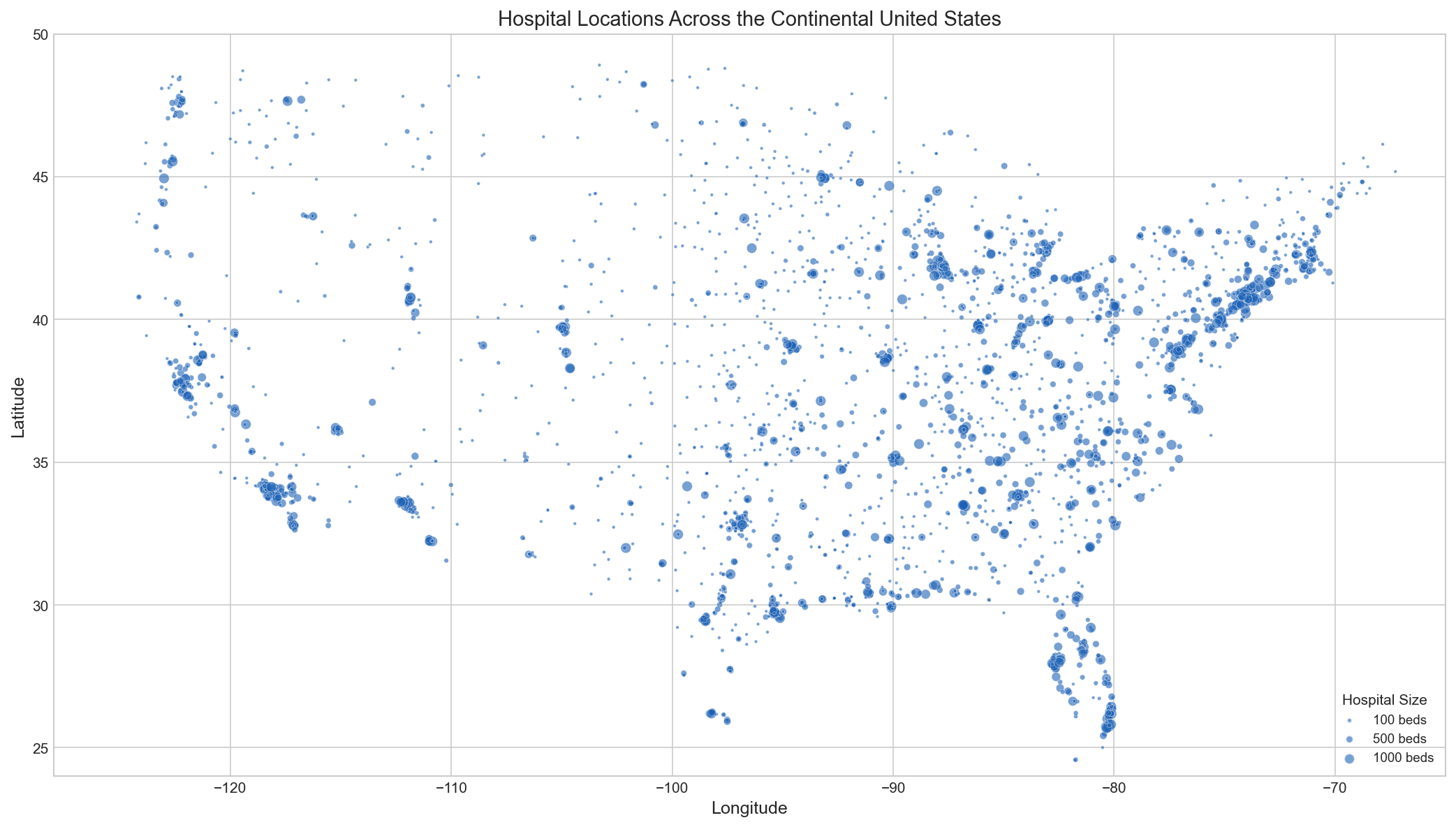 Distribution of hospitals across the continental United States. Point size represents bed count. Notice the clustering along coasts and around major metro areas.
Building the Distance Matrix
The core of this analysis is a distance matrix: the distance from every hospital to every other hospital. With ~7,600 hospitals, that’s about 58 million pairwise distances.
# Extract coordinates
x <- hospitals$Longitude
y <- hospitals$Latitude

# Create spatial points dataframe
# The projection string tells R we're working with lat/long on a globe
xy <- SpatialPointsDataFrame(
  matrix(c(x, y), ncol = 2),
  data.frame(ID = seq_along(x)),
  proj4string = CRS("+proj=longlat +ellps=WGS84 +datum=WGS84")
)

# Calculate all pairwise distances (in meters)
# distm handles spherical geometry - it knows the Earth is round
mdist <- distm(xy)

# Label rows and columns
colnames(mdist) <- hospitals$ADDRESS
rownames(mdist) <- hospitals$ADDRESS
What happens if you change the coordinate system? Using distm from the geosphere package calculates great-circle distances on a sphere. Simple Euclidean distance on lat/long would be wrong because degrees of longitude shrink as you move toward the poles.
See it with a tiny example
Imagine 4 hospitals: A, B, C, D positioned in 2D space:
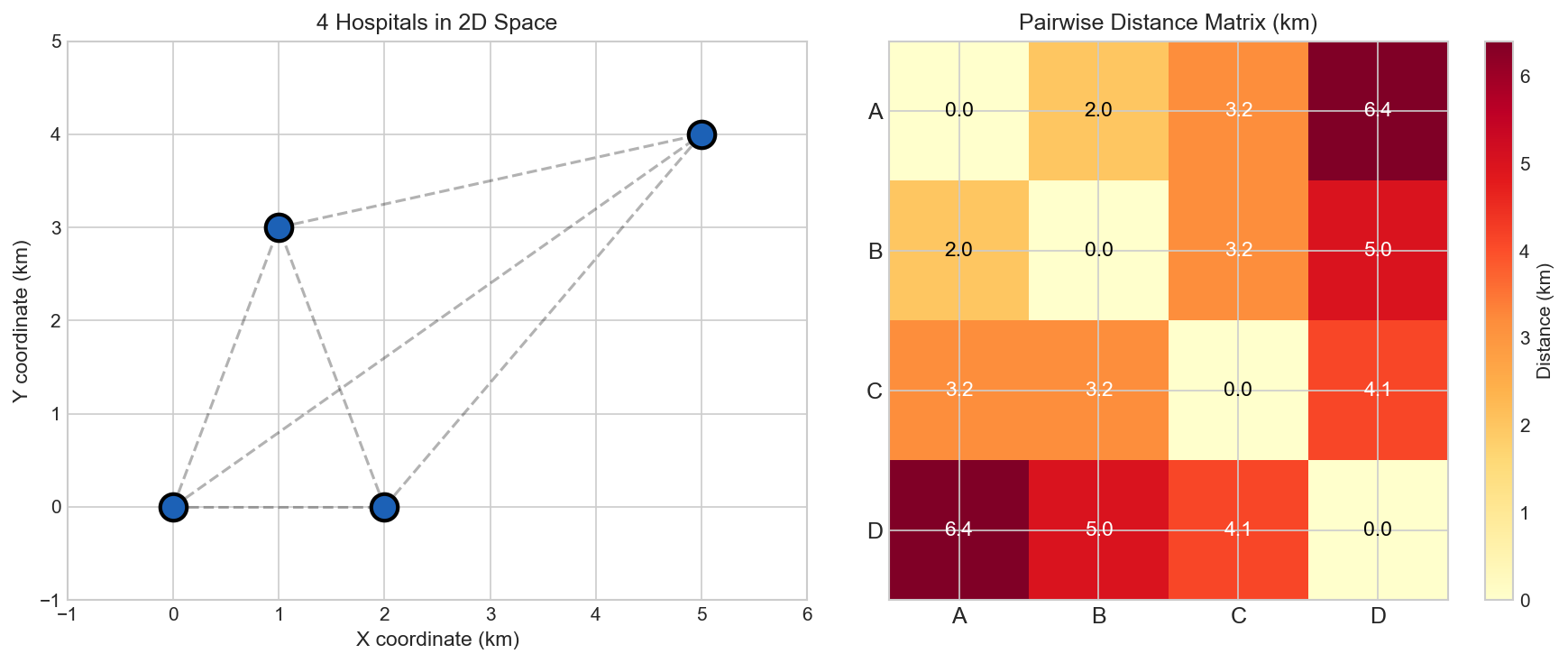The distance matrix captures all pairwise distances. The diagonal is always 0 (distance from a hospital to itself). The matrix is symmetric because distance(A→B) = distance(B→A).
From this matrix, we can find:
- Hospital A's closest neighbor is B (2.0 km)
- Hospital D is the most isolated (minimum distance 5.0 km to C)
First Attempt: Single Minimum Distance
The simplest approach: for each hospital, find the distance to its nearest neighbor. Classify based on that distance.
# Replace diagonal with Inf (so we don't pick "distance to self")
mdist2 <- mdist
diag(mdist2) <- Inf

# Find minimum distance for each hospital
min_distances <- apply(mdist2, 1, min)

# Classification thresholds (in meters)
# These are hypothesis-driven, not validated
hospitals <- hospitals %>%
  mutate(
    MinDistance = min_distances,
    Classification = case_when(
      MinDistance <= 3000   ~ "Very Urban",   # < 3 km
      MinDistance <= 12000  ~ "Urban",        # 3-12 km
      MinDistance <= 20000  ~ "Suburban",     # 12-20 km
      MinDistance <= 30000  ~ "Rural",        # 20-30 km
      TRUE                  ~ "Very Rural"    # > 30 km
    )
  )

table(hospitals$Classification)
The problem: This approach has a flaw. Two hospitals might be 100 meters apart (a hospital campus), but there’s nothing else around for miles. Using just the minimum distance, we’d label them “Very Urban” when they’re actually isolated.
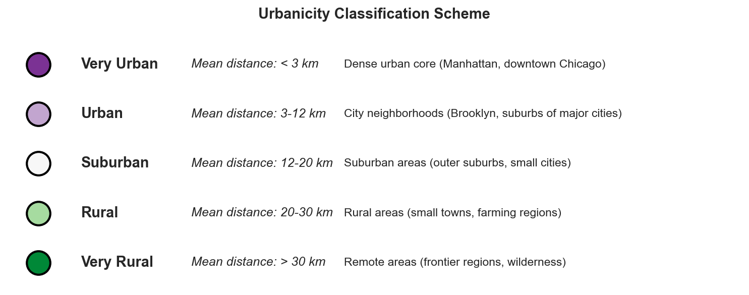 The classification scheme based on average distance to k nearest hospitals.
The Fix: K-Nearest Neighbors
Instead of just the closest hospital, we look at the k closest and average their distances. This smooths out the noise from hospital campuses and isolated pairs.
# For each hospital, get the 5 smallest distances
k <- 5
sorted_distances <- t(apply(mdist2, 1, function(row) sort(row)[1:k]))

# Average the k nearest distances
mean_distances <- rowMeans(sorted_distances)

# Reclassify using mean distance
hospitals <- hospitals %>%
  mutate(
    MeanDistance = mean_distances,
    Classification_K = case_when(
      MeanDistance <= 3000   ~ "Very Urban",
      MeanDistance <= 12000  ~ "Urban",
      MeanDistance <= 20000  ~ "Suburban",
      MeanDistance <= 30000  ~ "Rural",
      TRUE                   ~ "Very Rural"
    )
  )
What happens if you change k? With k=1, you get the original noisy results. Higher k values smooth things out but might miss genuinely dense pockets. k=5 seemed like a reasonable balance for this dataset.
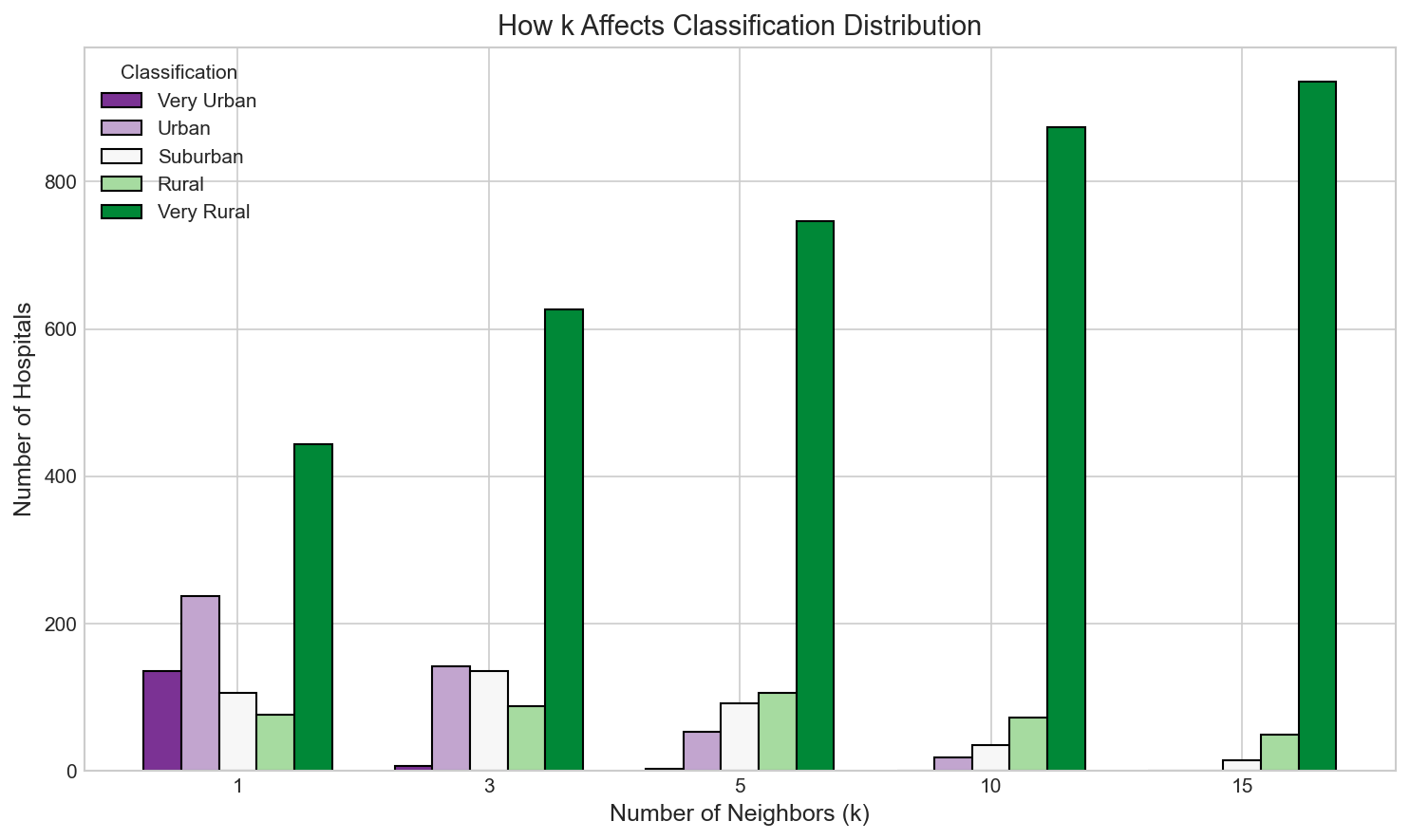 How the choice of k affects classification distribution. Higher k values shift hospitals toward less urban classifications as we include more distant neighbors in the average.
Comparing the Methods
The difference between single-distance and k-nearest classification is dramatic in areas with hospital campuses.
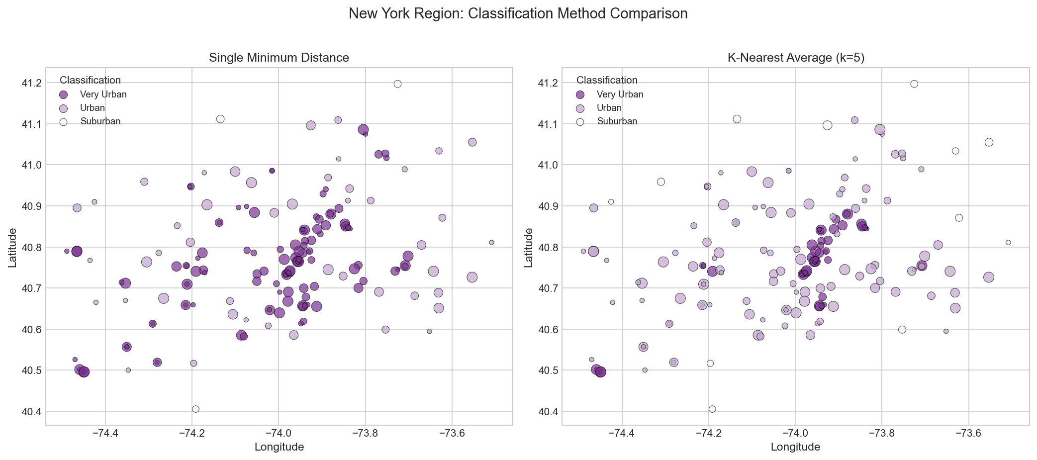 New York region comparison. Left: Single minimum distance (noisy). Right: K-nearest average (smoother, more realistic).
Key observations:
- Manhattan is uniformly “Very Urban” with k-nearest, as expected
- Brooklyn and Queens show a gradient, transitioning from Urban to Suburban
- Small clusters that appeared “Very Urban” with single-distance are correctly classified as Suburban with k-nearest
Regional Comparisons
Different regions show the method working as expected:
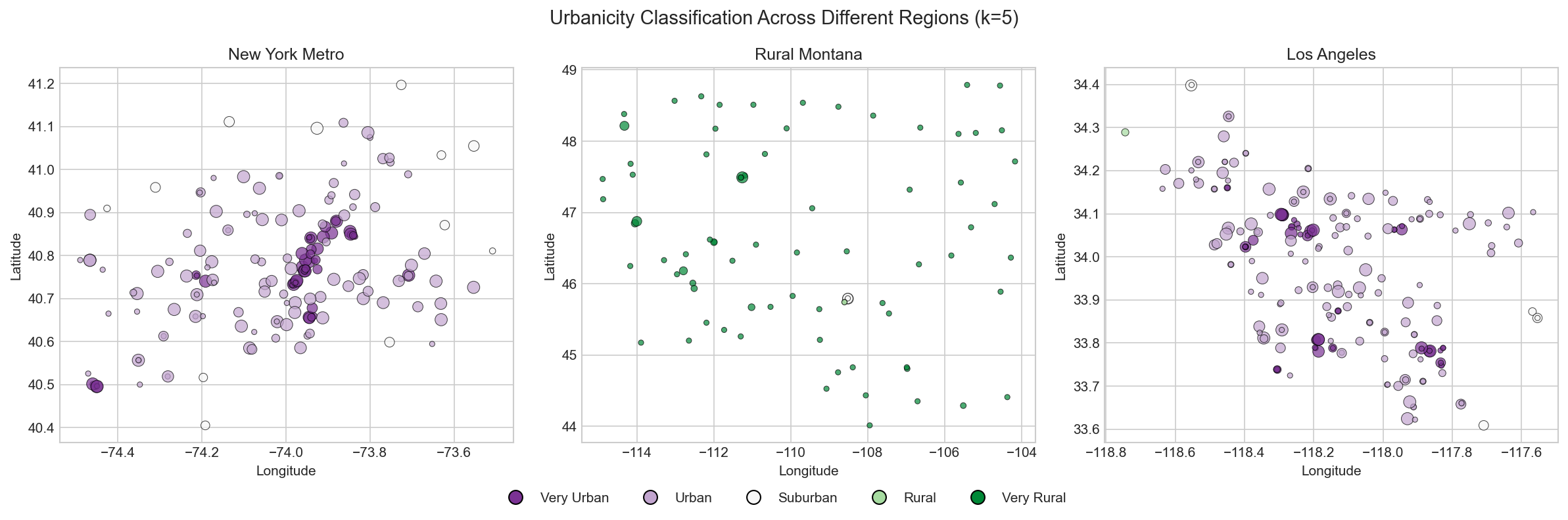 Three regions showing urbanicity classifications. Urban cores are purple, rural areas are green.
New York Metro:
- Manhattan: Very Urban (dense hospital network)
- Brooklyn/Queens: Urban to Suburban gradient
- Long Island suburbs: Suburban to Rural
Los Angeles:
- Downtown LA: Very Urban
- Sprawling suburbs: Mix of Urban and Suburban
- Desert edges: Rural to Very Rural
Montana:
- Few hospitals, widely spaced
- Almost entirely Rural to Very Rural
- Small clusters around cities like Billings
Limitations and Extensions
This approach has real limitations:
What it misses:
- Hospital type matters: Specialty hospitals (children’s, psychiatric, VA) cluster differently than general hospitals
- Thresholds are arbitrary: Why 3km vs 4km as the Urban cutoff? These are judgment calls.
- Static snapshot: Hospitals open and close. The data is a point in time.
- Ignores hospital size: A 50-bed rural hospital and a 500-bed urban medical center are treated the same
- Doesn’t account for terrain: 10km in Manhattan means something different than 10km in the Rockies
Possible improvements:
- Weight by bed count: Larger hospitals serve larger populations
- Use drive time instead of straight-line distance: More realistic for healthcare access
- Incorporate other infrastructure: Fire stations, schools, grocery stores
- Validate against census urbanicity measures: See how well this proxy actually works
- Try different k values: Build a sensitivity analysis
What this could be useful for:
- Quick urbanicity estimates for areas without recent census data
- Identifying underserved areas (long distances to hospitals)
- Retail site selection (hospital density correlates with commercial activity)
- Academic research on healthcare access disparities
Summary
-
Hospital distances can proxy for urbanicity. Dense hospital clusters indicate dense populations.
-
Single minimum distance is noisy. Two hospitals on the same campus can look “very urban” even in rural areas.
-
K-nearest averaging smooths the noise. Looking at the 5 nearest hospitals gives a more realistic picture.
-
The thresholds are hypotheses, not facts. The 3km/12km/20km/30km boundaries were chosen based on intuition, not rigorous validation.
-
Maps tell the story. The visual comparison between methods makes the improvement obvious.
Data Sources
The hospital data used in this analysis was originally from the Homeland Infrastructure Foundation-Level Data (HIFLD) open data portal, but that link has since expired. A similar dataset is available from Rearc on the Databricks Marketplace.
Other sources for hospital location data:
For the ggmap package, you’ll need a Google Maps API key. See the ggmap documentation for setup instructions.
Appendix: Complete R Script
Full Implementation
# ============================================
# Measuring Urbanicity with Hospital Distances
# ============================================

# Load packages
library(tidyverse)
library(ggmap)
library(geosphere)
library(sp)
library(matrixStats)

# ----- Load Data -----
hospitals <- read.csv("hospitals.csv")

# Filter and clean
hospitals <- hospitals %>%
  filter(STATUS == "OPEN") %>%
  filter(!is.na(X) & !is.na(Y)) %>%
  mutate(
    Longitude = X,
    Latitude = Y,
    BEDS = ifelse(BEDS < 0, NA, BEDS)
  )

# ----- Build Distance Matrix -----
x <- hospitals$Longitude
y <- hospitals$Latitude

xy <- SpatialPointsDataFrame(
  matrix(c(x, y), ncol = 2),
  data.frame(ID = seq_along(x)),
  proj4string = CRS("+proj=longlat +ellps=WGS84 +datum=WGS84")
)

mdist <- distm(xy)
diag(mdist) <- Inf

# ----- Single Distance Classification -----
min_distances <- apply(mdist, 1, min)

hospitals$MinDistance <- min_distances
hospitals$Class_Single <- case_when(
  hospitals$MinDistance <= 3000   ~ "Very Urban",
  hospitals$MinDistance <= 12000  ~ "Urban",
  hospitals$MinDistance <= 20000  ~ "Suburban",
  hospitals$MinDistance <= 30000  ~ "Rural",
  TRUE                            ~ "Very Rural"
)

# ----- K-Nearest Classification -----
k <- 5
sorted_distances <- t(apply(mdist, 1, function(row) sort(row)[1:k]))
mean_distances <- rowMeans(sorted_distances)

hospitals$MeanDistance <- mean_distances
hospitals$Class_KNearest <- case_when(
  hospitals$MeanDistance <= 3000   ~ "Very Urban",
  hospitals$MeanDistance <= 12000  ~ "Urban",
  hospitals$MeanDistance <= 20000  ~ "Suburban",
  hospitals$MeanDistance <= 30000  ~ "Rural",
  TRUE                             ~ "Very Rural"
)

# ----- Mapping -----
# Register your Google Maps API key
# register_google(key = "YOUR_API_KEY")

# Create plot data by classification
plot_urbanicity <- function(location, zoom = 9) {
  basemap <- ggmap(get_googlemap(center = location, zoom = zoom, maptype = "roadmap"))

  basemap +
    geom_point(
      data = hospitals,
      aes(x = Longitude, y = Latitude, fill = Class_KNearest, size = BEDS),
      pch = 21, alpha = 0.7
    ) +
    scale_fill_manual(
      values = c(
        "Very Urban" = "#7b3294",
        "Urban" = "#c2a5cf",
        "Suburban" = "#f7f7f7",
        "Rural" = "#a6dba0",
        "Very Rural" = "#008837"
      ),
      breaks = c("Very Urban", "Urban", "Suburban", "Rural", "Very Rural")
    ) +
    scale_size(range = c(1, 6), breaks = c(100, 250, 500, 1000)) +
    labs(fill = "Urbanicity", size = "Beds") +
    guides(fill = guide_legend(override.aes = list(size = 5)))
}

# Example: New York City
plot_urbanicity(c(lon = -73.987, lat = 40.745), zoom = 9)

# Example: Los Angeles
plot_urbanicity(c(lon = -118.25, lat = 34.05), zoom = 9)

# ----- Summary Statistics -----
print("Single Distance Classification:")
print(table(hospitals$Class_Single))

print("\nK-Nearest Classification (k=5):")
print(table(hospitals$Class_KNearest))
PS: This tutorial is a remaster of work I did in early 2020, before I started my first data science role. I’ve cleaned up the code and explanations, but kept the core analysis intact. The original was rough around the edges, but it taught me a lot about translating ideas into working code.